


Create a Flat Download Button
In the following tutorial you will learn how to create a flat download button in Graphic for iPad.
For starters you will learn how to setup a simple grid and how to create the cloud shape using basic tools and vector shape building techniques. Next, you'll learn how to create the main button shape and how to add subtle shading and highlights for your objects.
Finally, you will learn how to create a simple piece of text and how to stylize it.
Step 1
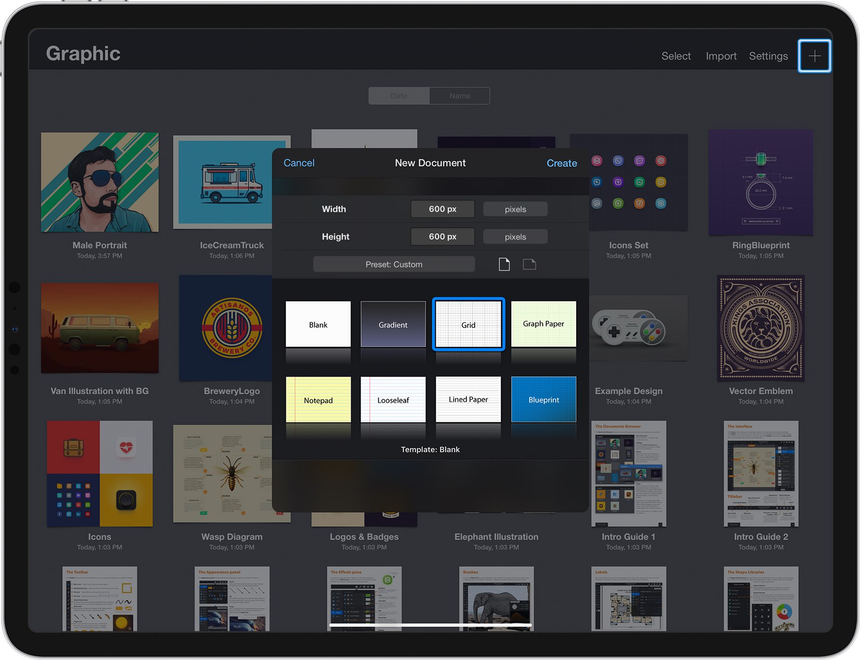
From the Documents Browser, tap the plus button at the top-right corner of the Titlebar and choose the Grid document style.
Select Pixels for the base units, set the Width and the Height to 600 px, and then tap the Create button.
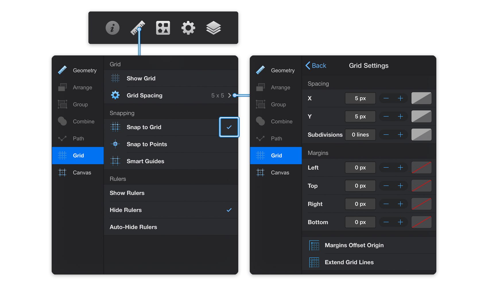
Next, we'll set up the document grid. Focus on the right side of the Titlebar and tap the ruler icon to open the Properties panel and go to the Grid pane.
Make sure that the Snap to Grid feature is enabled and keep in mind that this is where you should come whenever you wish to enable or disable the grid or the Snap to Grid. Finally, open that Grid Settings pane, enter 5 px in both Spacing boxes and 0 lines in the Subdivisions box.
Step 2
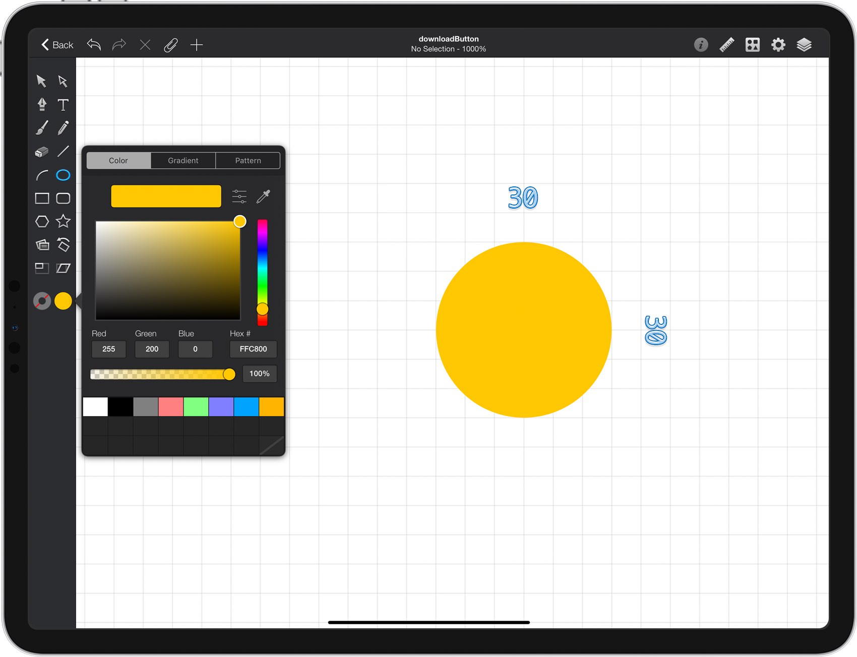
Focus on the Toolbar and notice that by default the Fill color is set to white while the Line color is set to black. Tap the Fill color well and set its color to R=255 G=215 B=0 and then tap the Line color well. Drag the Alpha slider to 0% and this will make your line invisible.
Pick the Ellipse Tool and create a 30 px circle - the grid and the Snap to Grid feature will ease your work.
Step 3
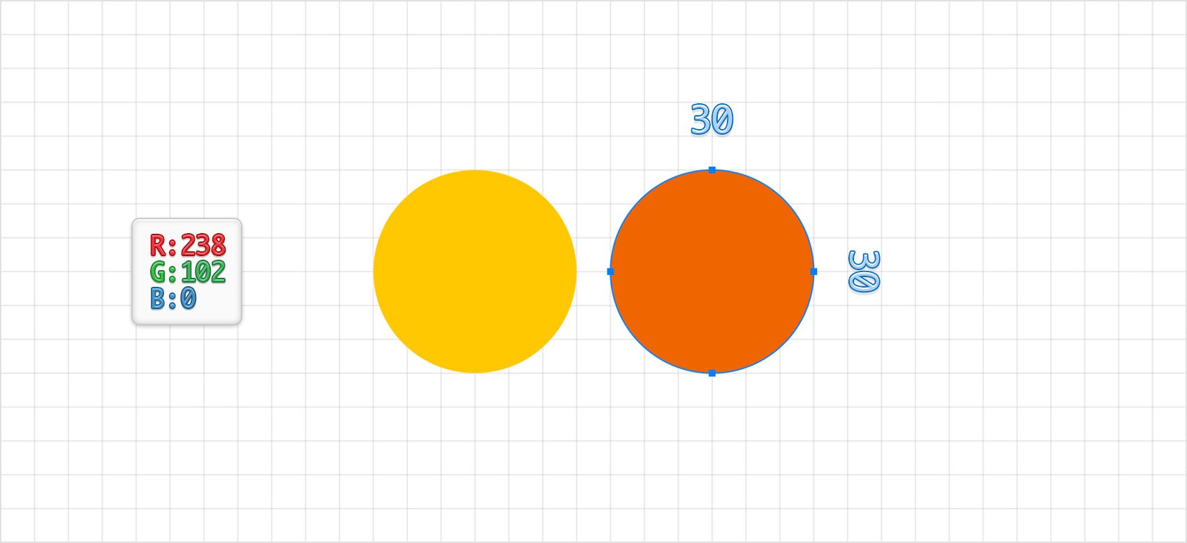
Set the Fill color to R=238 G=102 B=0 and make sure that the Ellipse Tool is still active. Create a second, 30 px circle and place it exactly as shown in the following image.
Step 4
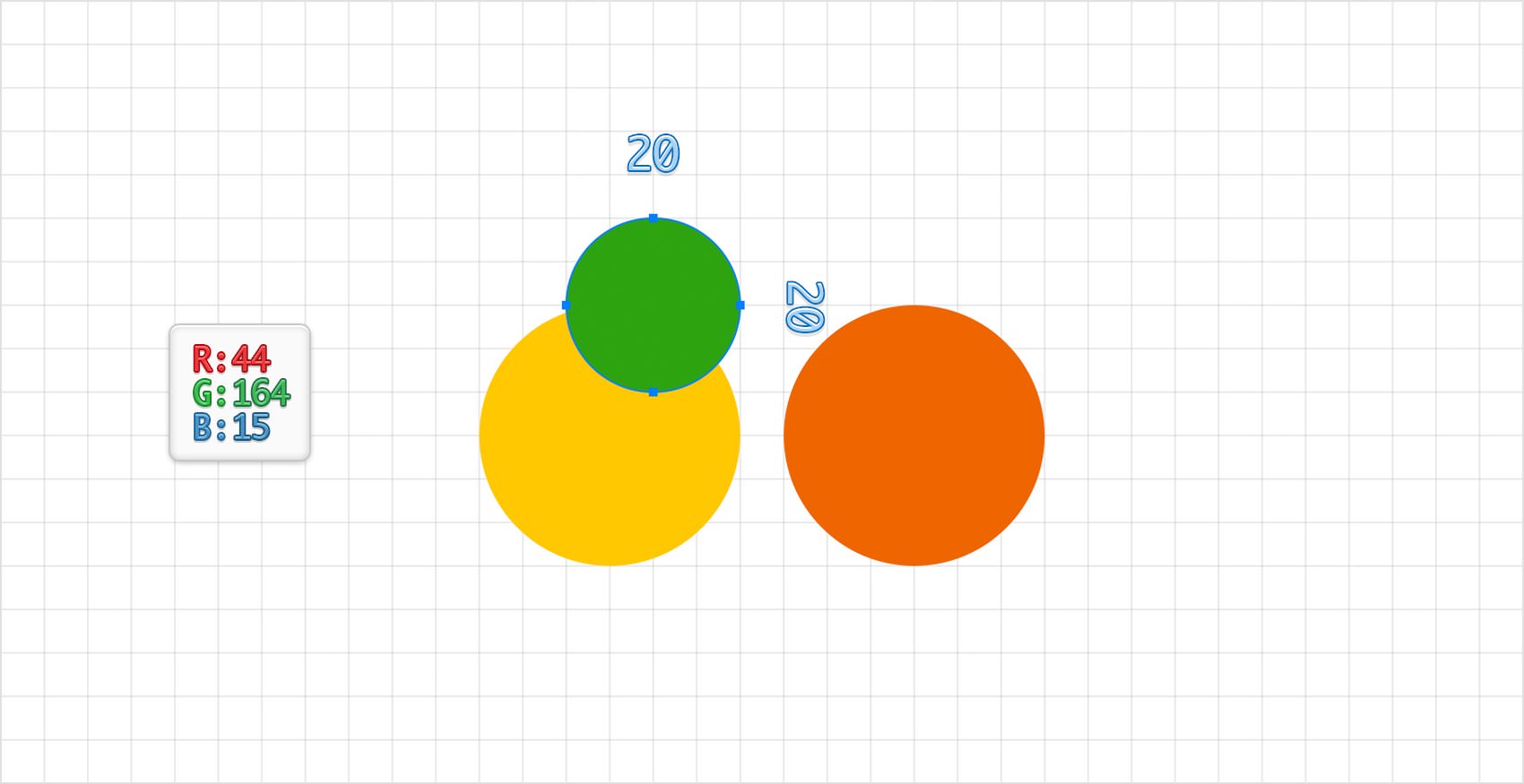
Set the Fill color to R=44 G=164 B=15, make sure that the Ellipse Tool is still active. Create a 20 px circle and place it exactly as shown in the following image.
Step 5
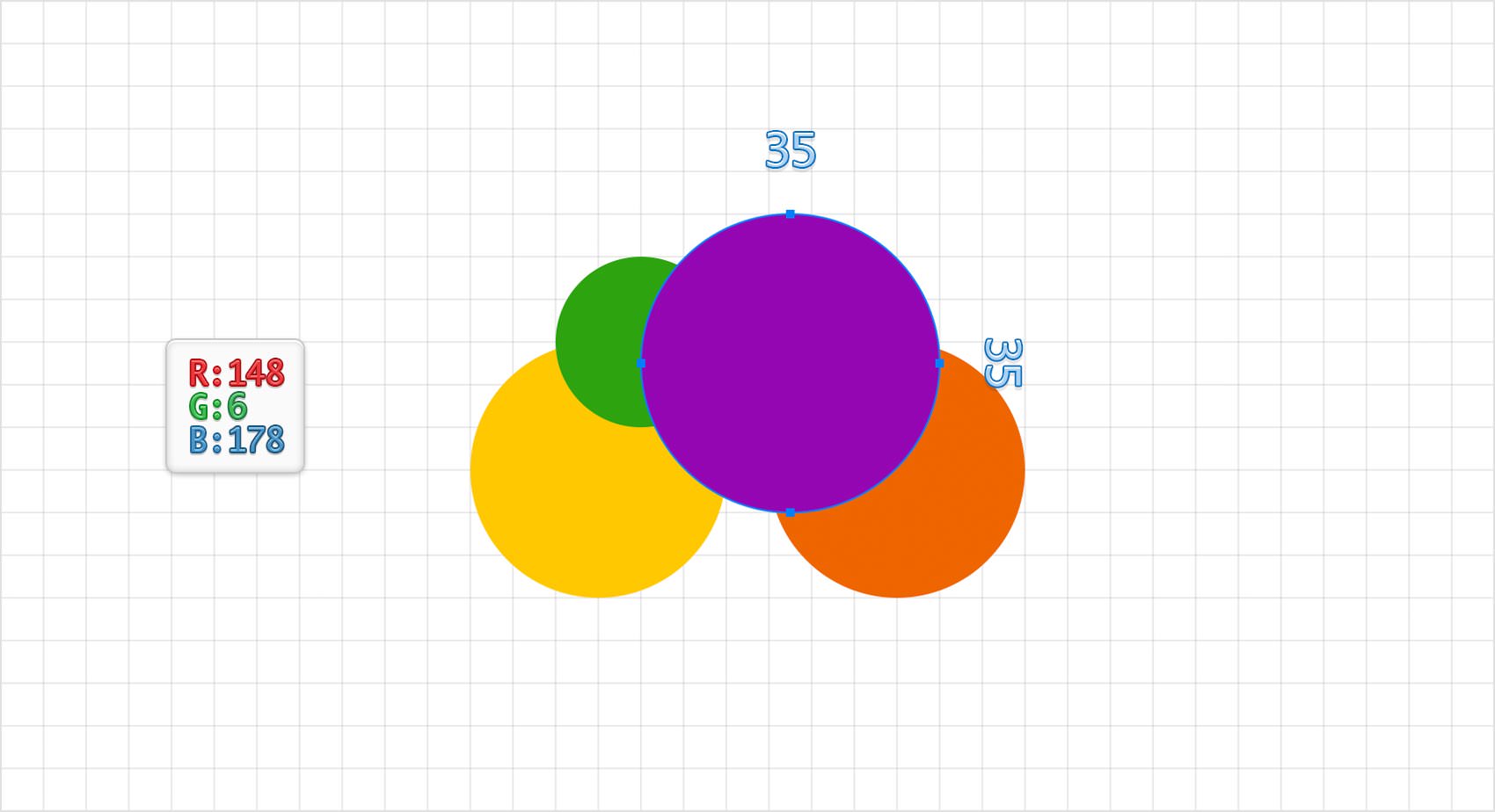
Set the Fill color to R=148 G=6 B=178, make sure that the Ellipse Tool is still active, create a 35 px circle and place it exactly as shown in the following image.
Step 6
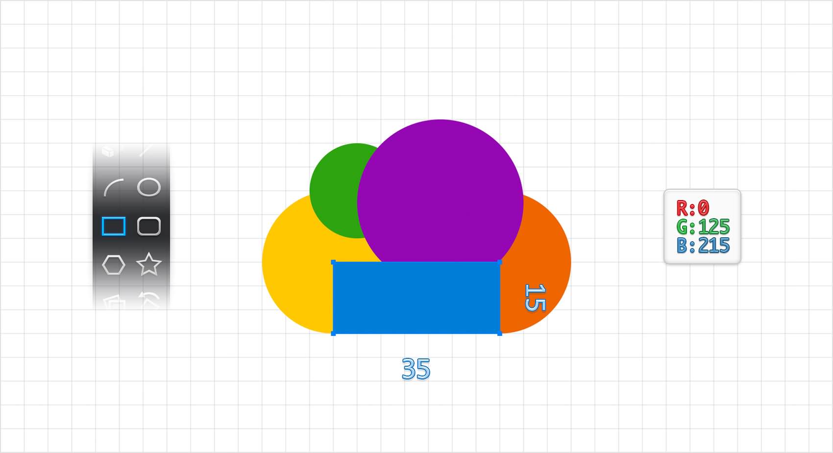
Set the Fill color to R=0 G=125 B=215, pick the Rectangle Tool, create a 35 x 15 px shape and place it exactly as shown in the following image.
Step 7
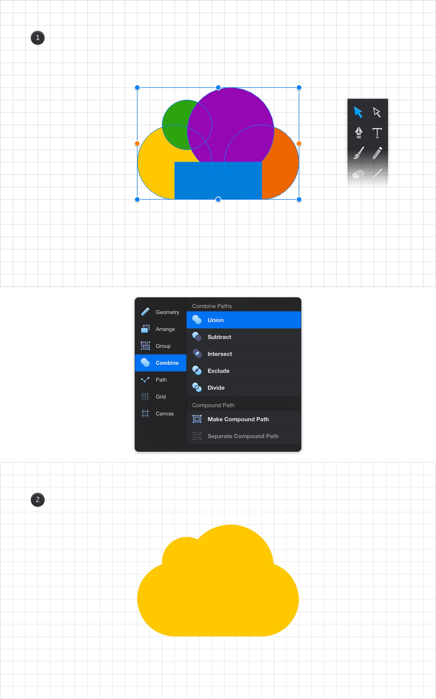
Using the Move Tool, select all the shapes made so far. Open the Combine pane from the Properties panel and tap the Union button.
Step 8
For the following steps you will need a grid every 1 px which means that you need to return to the Grid pane, tap the Grid Settings pane and enter 1 px for both Spacing boxes. Return to your Toolbar, remove the color from the Fill and then tap the Line color well and set it to R=0 G=125 B=215.
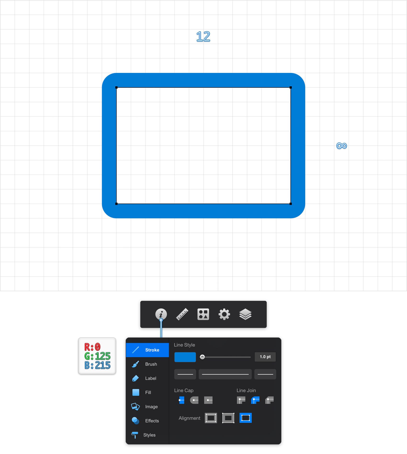
Pick the Rectangle Tool and create a 12 x 8 px shape. Make sure that this new shape stays selected, focus on the right side of your Titlebar and tap the leftmost icon to open the Appearance panel. Focus on the Stroke pane and set the color to R=0 G=125 B=215 Set the Width to 1 pt and then tap the Outside Alignment and the Round Join buttons. In the end your blue path should look like in the following image.
Step 9
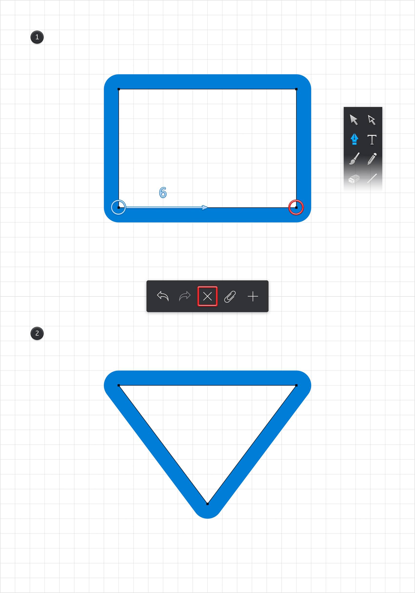
Pick the Path Selection Tool and focus on the bottom side of your blue rectangle. Select the right anchor point and tap the X button from the left side of your Titlebar to remove it.
Select the remaining, bottom anchor point and drag it 6 px to the right as shown in the second image. In the end this should turn your rectangle into a triangle.
Step 10
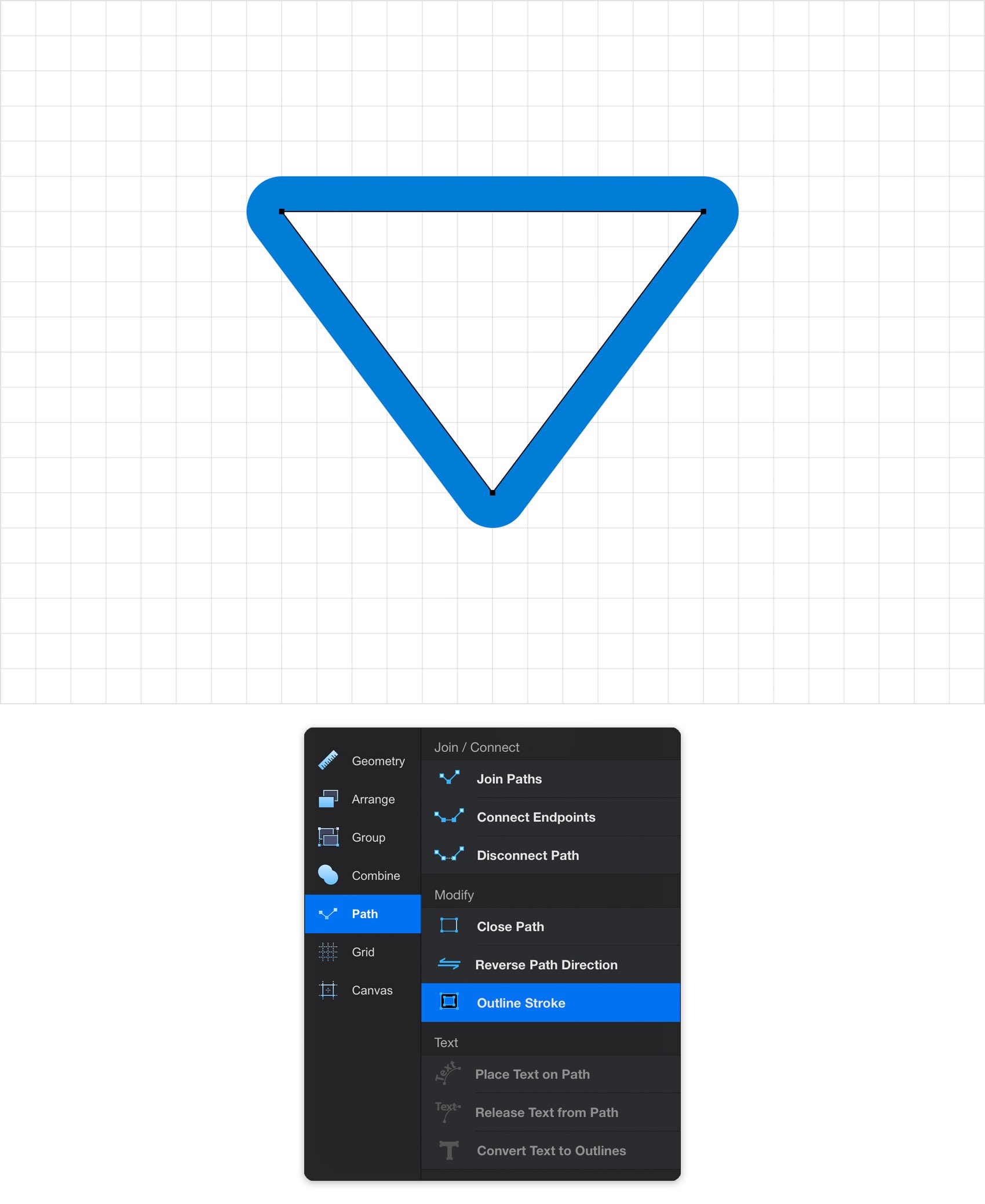
Make sure that your triangle is still selected, open the Path pane and tap the Outline Stroke button.
Step 11
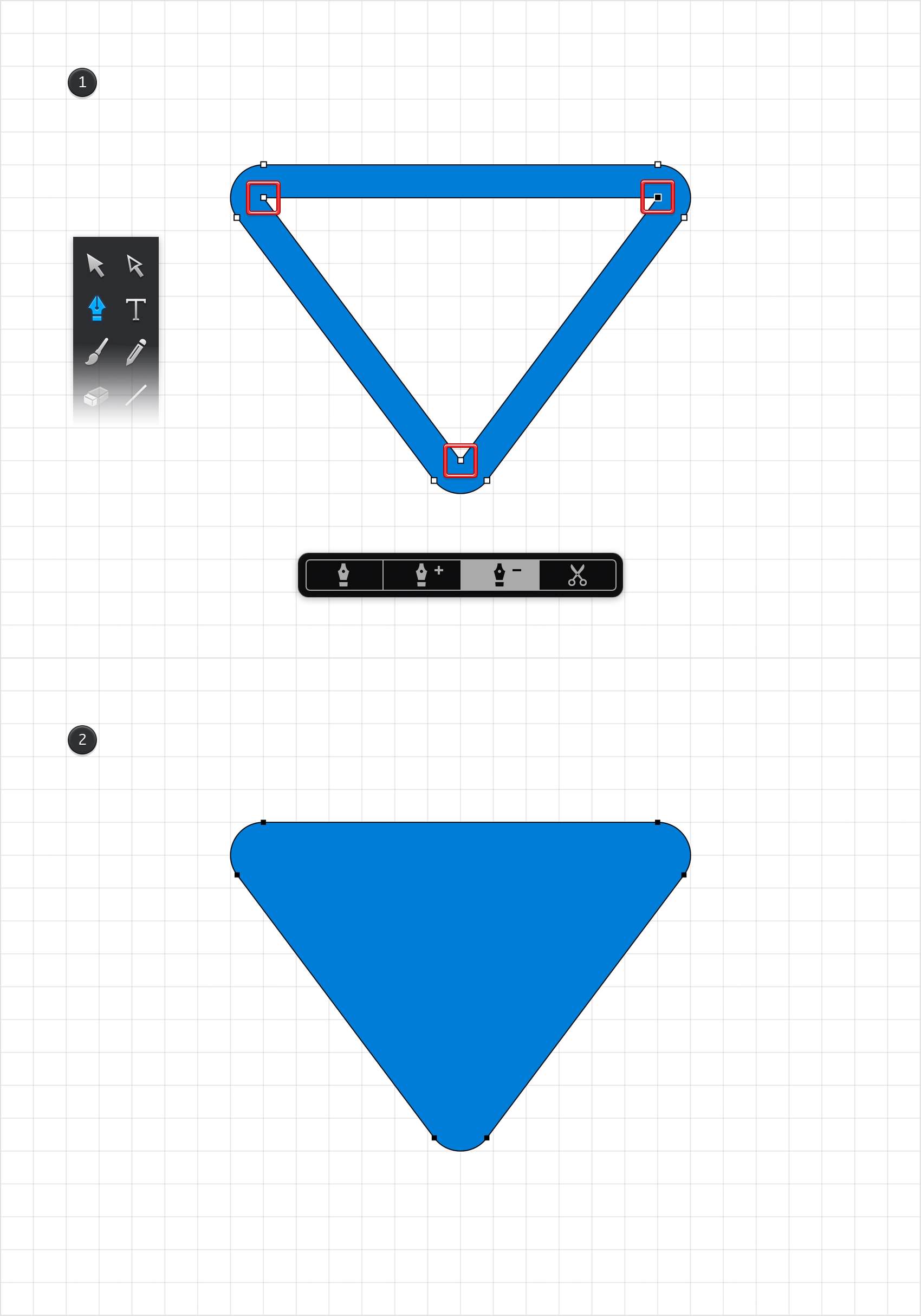
Select the Pen Tool, focus on the newly opened tool pane and activate the Delete Points mode. Return to your blue triangle and tap the three, inner anchor points to remove them.
Step 12
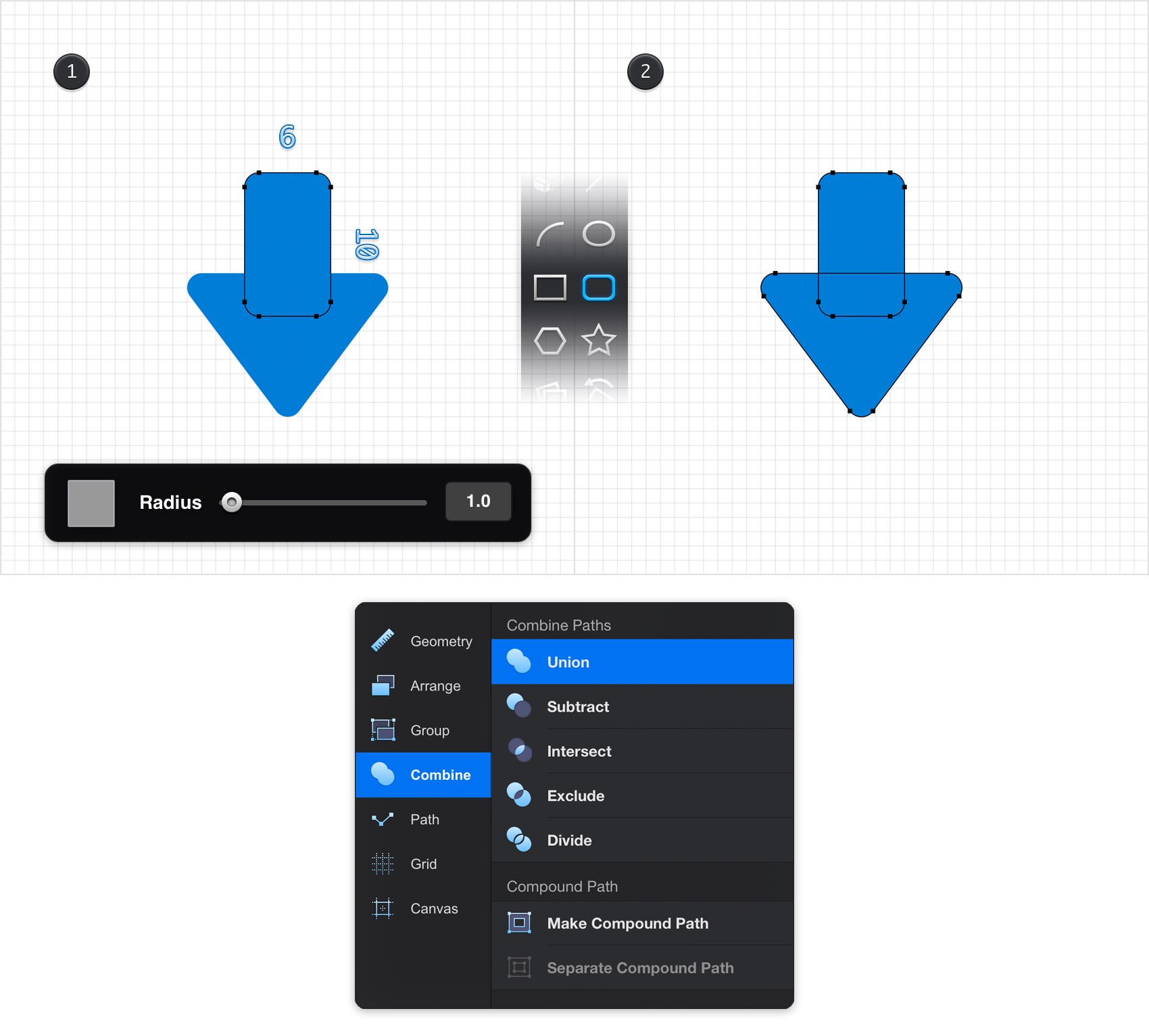
Pick the Rounded Rectangle Tool and set the Radius to 1. Move to your canvas, create a 6 x 10 px shape and place it exactly as shown in the first image. Select this rounded rectangle along with the triangle and tap the Union button from the Combine pane.
Step 13
Using the Move Tool, select your blue arrow and place it roughly as shown in the following image.

Step 14
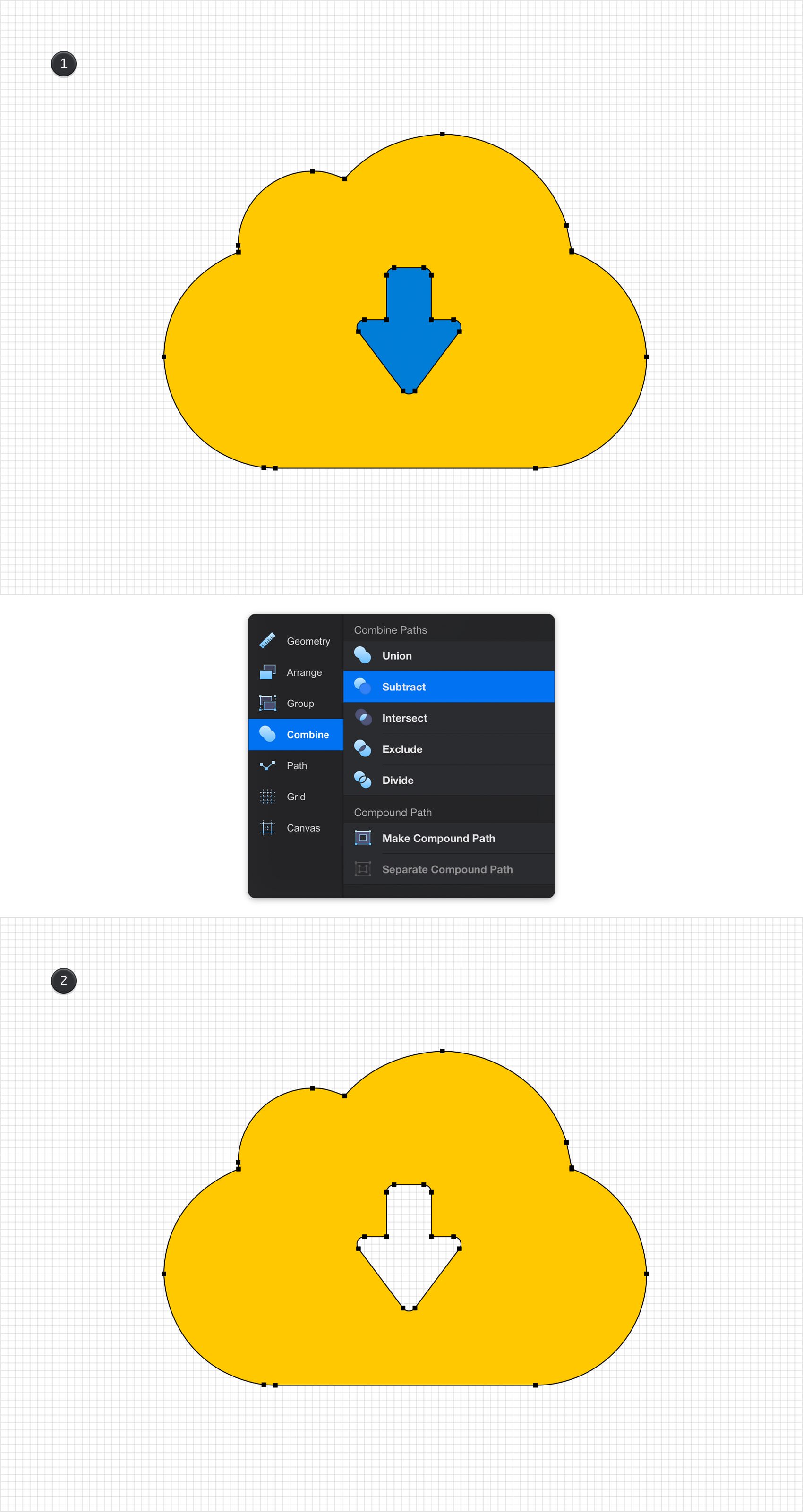
Reselect your blue arrow along with the yellow cloud and tap the Subtract button from the Combine pane.
Step 15
For the following steps you will need a grid every 5 px, so return to the Grid pane, open the Grid Settings open and enter 5px for both Spacing boxes.
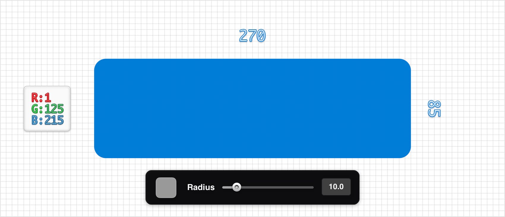
Focus on your Toolbar, remove the color from the Line and then select the Fill and set its color to R=1 G=125 B=215. Pick the Rounded Rectangle Tool, set the Radius to 10 and create a 270 x 85 px shape.
Step 16
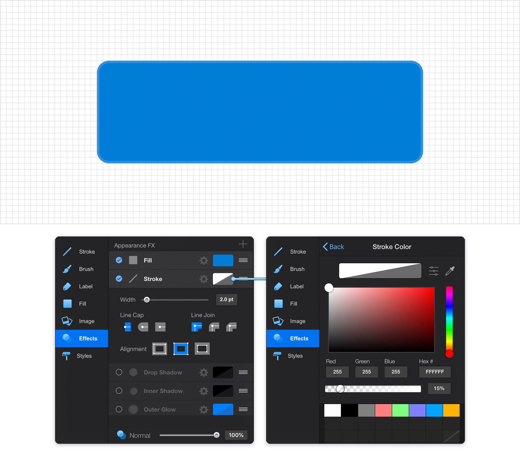
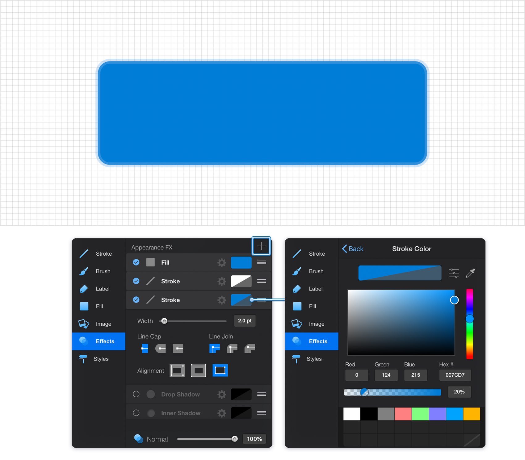
Make sure that your rounded rectangle stays selected, open the Effects pane and focus on the existing Stroke.
Set the Width to 2 pt, tap the Inside Alignment button and then tap the color well that stands for your stroke. Replace the existing color with white (R=255 G=2555 B=255) and drag the Alpha slider to 15%.
Step 17
Make sure that your rounded rectangle stays selected and keep focusing on the Effects pane.
Simply tap the plus button from the top, right corner of your pane and add a second Stroke for your selected shape. Select it and enter the attributes shown in the following image.
Step 18
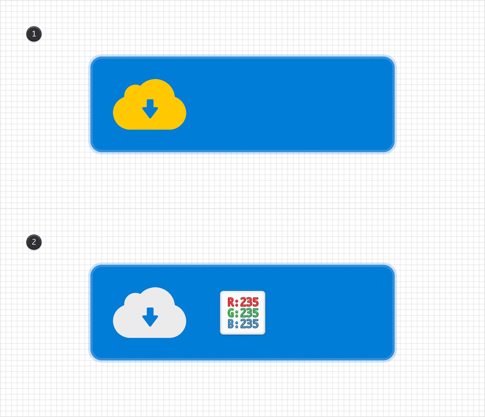
Select your cloud icon, place it as shown in the first image and replace the yellow used for the Fill with R=235 G=235 B=235.
Step 19
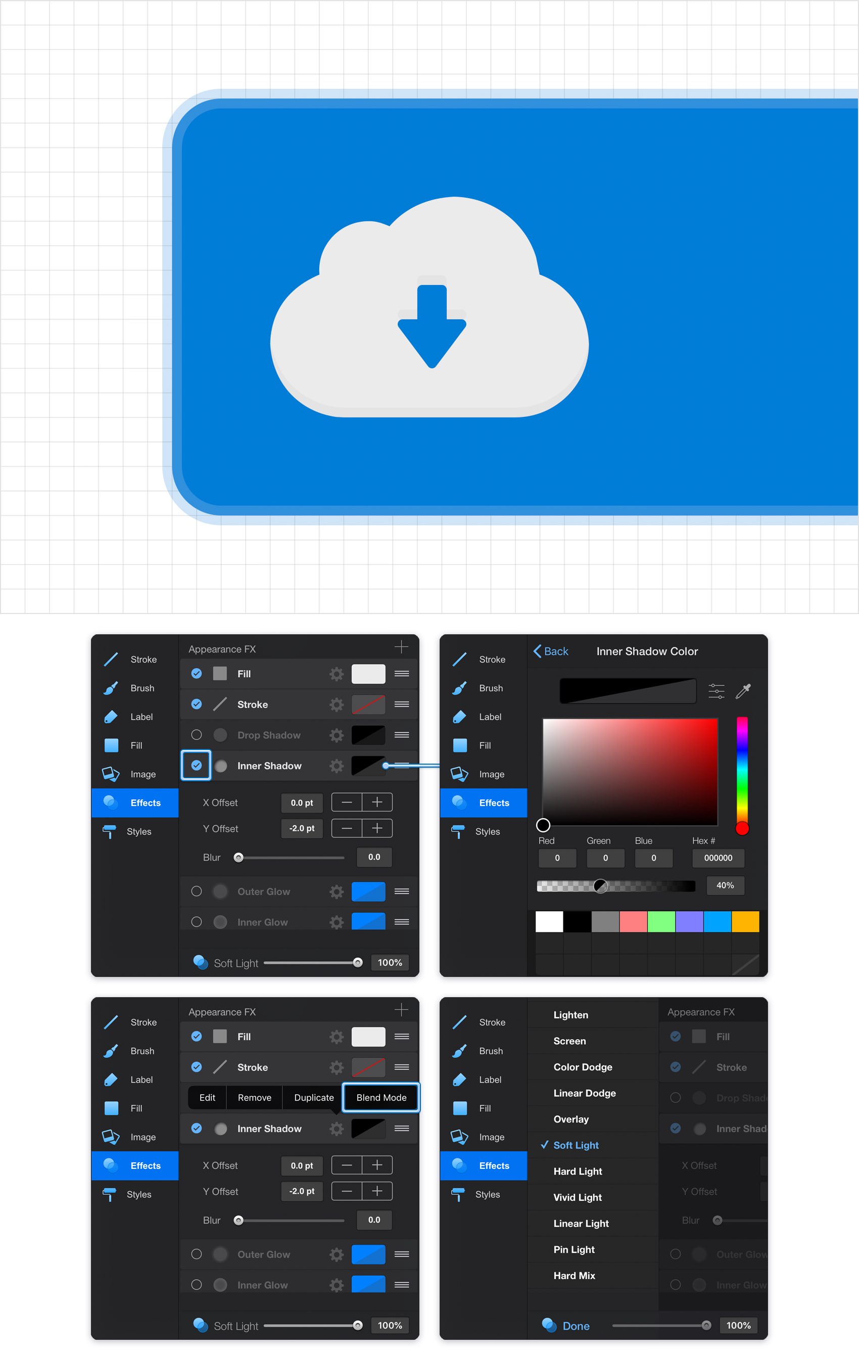
Make sure that your cloud icon stays selected and focus on the Effects pane. Activate the existing Inner Shadow and select it.
Enter -2 pt in the Y Offset box and 0 pt in the other two boxes. Next, tap the color well that stands for this effect, make sure that the color is set to black and drag the Alpha slider to 40%. Finally, tap the cogwheel icon that stands for your Inner Shadow, tap Blend Mode, select Soft Light and then tap that Done button.
Step 20
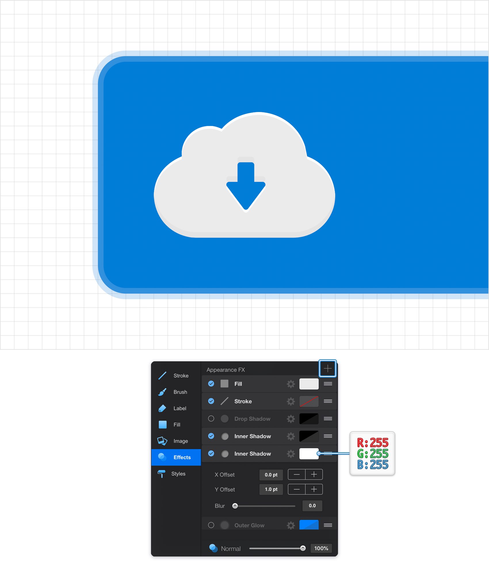
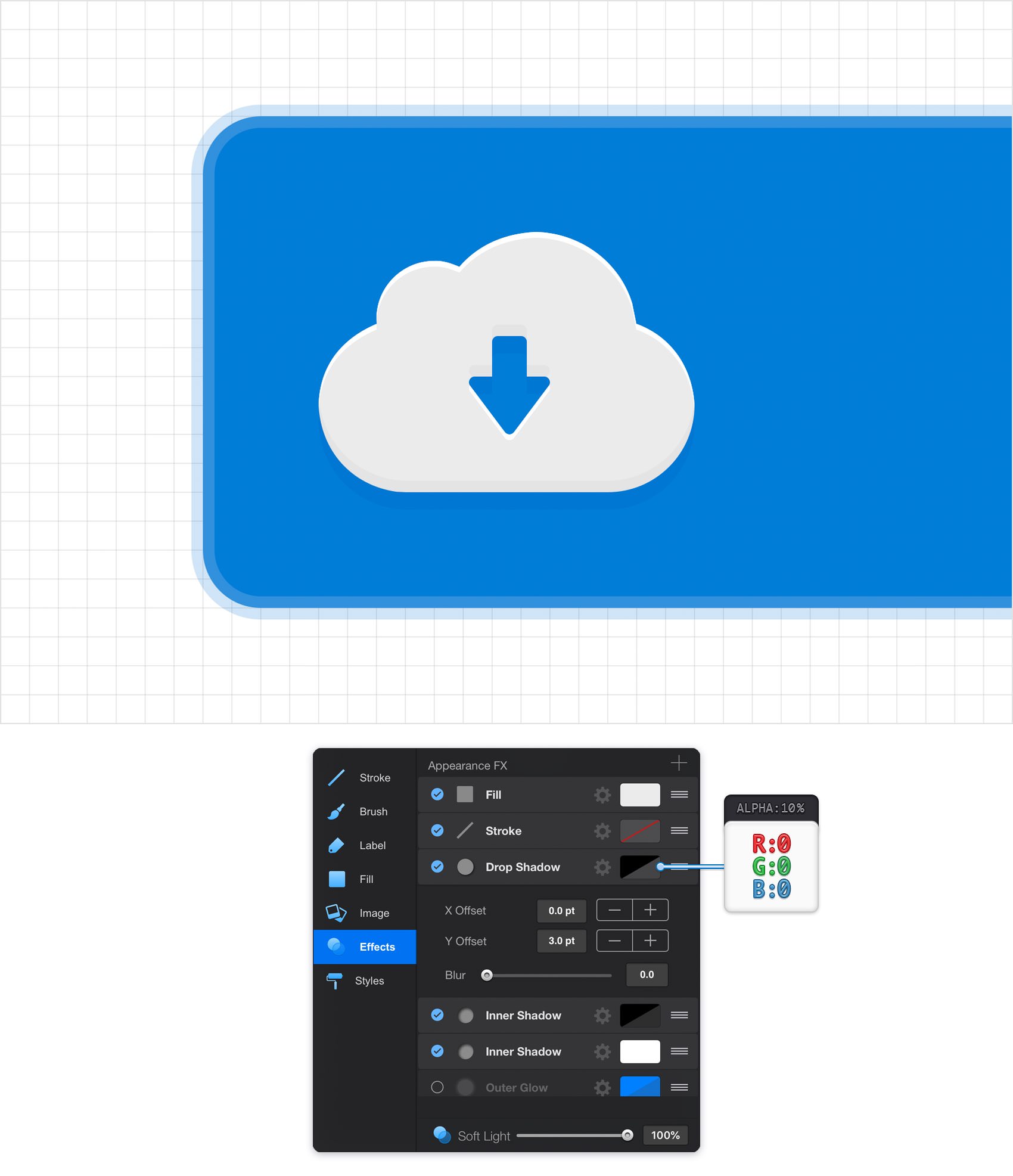
Make sure that your cloud icon is still selected, focus on the Effects pane and add a second Inner Shadow effect using that same plus button. Select the new effect and enter the attributes shown in the following image.
Step 21
Make sure that your cloud icon is still selected and keep focusing on the Effects pane.
Activate the existing Drop Shadow, select it and change the Blend Mode to Soft Light. Enter 3 pt in the Y Offset box and 0 pt in the other two boxes. Finally, tap that color well that stands for this new effect, make it black and drag the Alpha slider to 10%.
Step 22
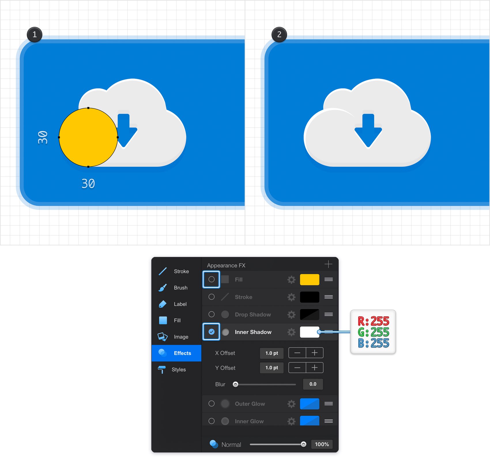
Using the Ellipse Tool, create a 30 px circle and place it exactly as shown in the following image. Make sure that this new shape stays selected and focus on the Effects pane.
Disable the Fill and then enable the Inner Shadow and select it. Enter 1 pt in the Offset boxes, set the Blur to 0 and then tap the color well and set it to white (R=255 G=255 B=255).
Step 23
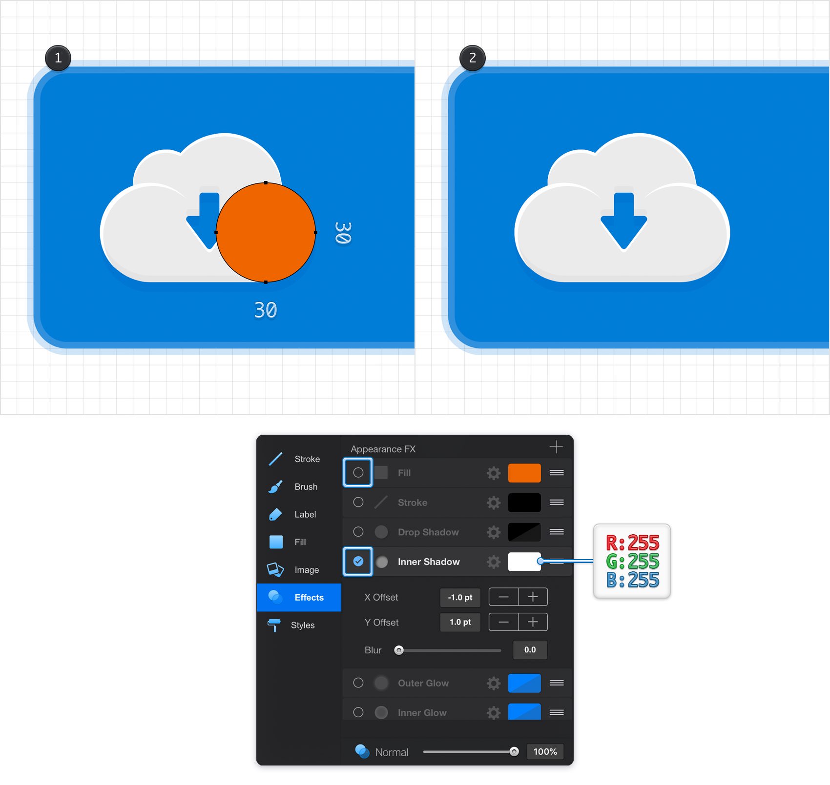
Using the Ellipse Tool, create another 30 px circle and place it exactly as shown in the following image.
Make sure that this new shape stays selected and focus on the Effects pane. Disable the Fill and then enable the Inner Shadow effect and enter the attributes shown in the following image.
Step 24
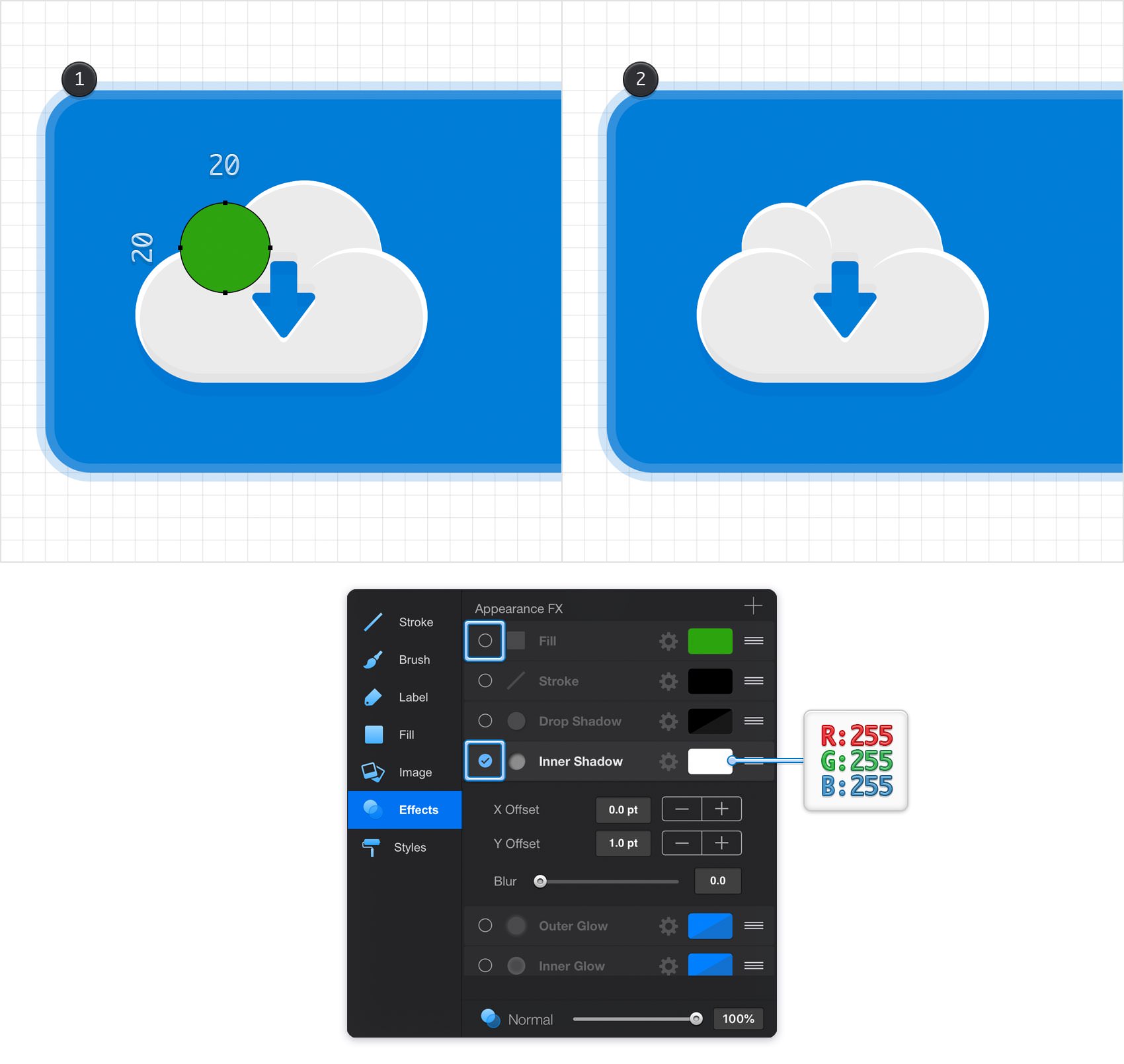
Using the Ellipse Tool, create a 20 px circle and place it exactly as shown in the following image.
Make sure that this new shape stays selected and focus on the Effects pane. Disable the Fill and then enable the Inner Shadow effect and enter the attributes shown in the following image.
Step 25
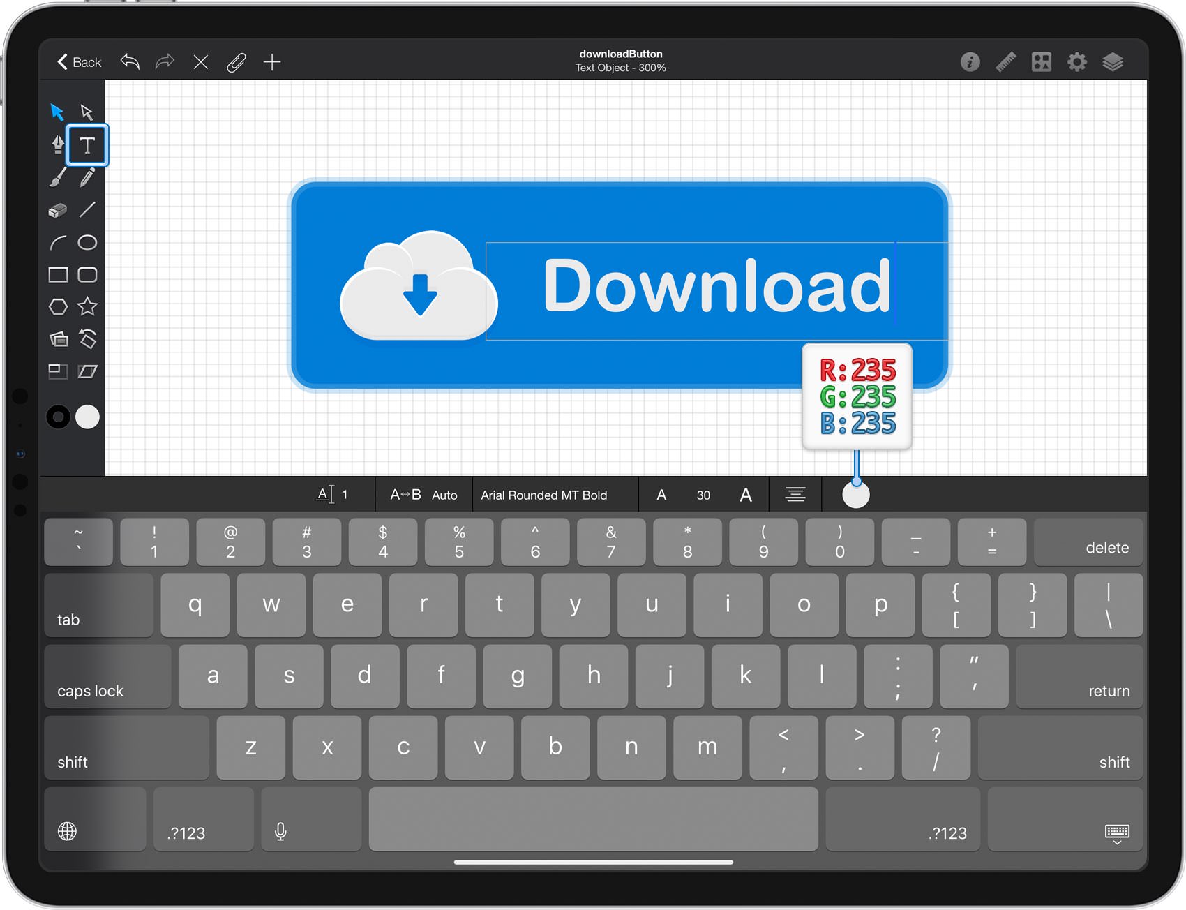
Pick the Text Tool from your Toolbar and then double tap inside that new field. Select the Arial Rounded MT Bold font, set the size to 30 pt and the color to R=235 G=235 B=235 and then add the "Download" piece of text. Using the Move Tool, select your piece of text and place it as shown in the following image.
Step 26
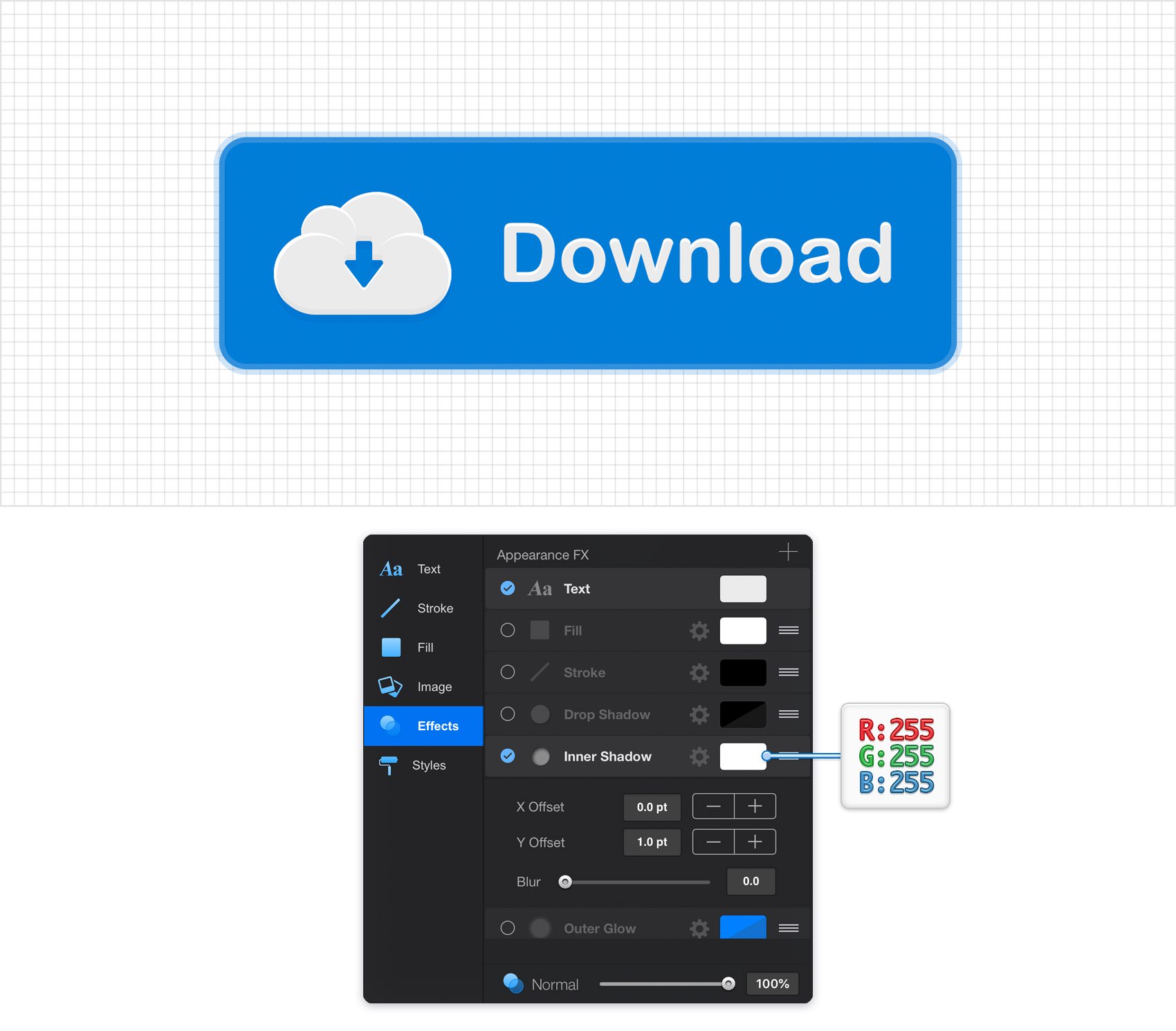
Make sure that your piece of text is still selected, focus on the Effects pane and activate the existing Inner Shadow effect. Select it and enter the attributes shown in the following image.
Step 27
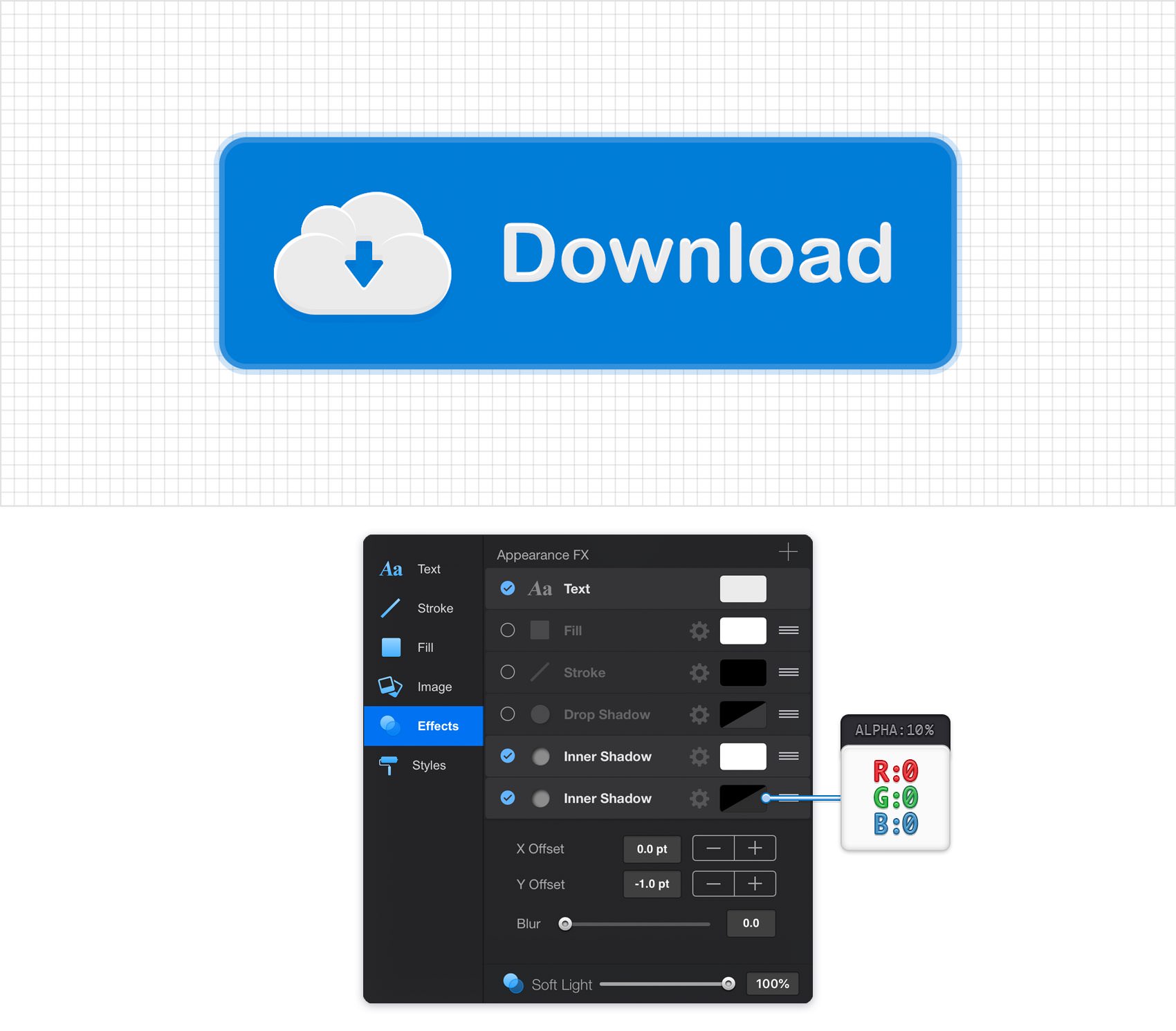
Make sure that your piece of text is still selected, keep focusing on the Effects pane and add a second Inner Shadow. Select this new effect and enter the attributes shown in the following image.
Step 28
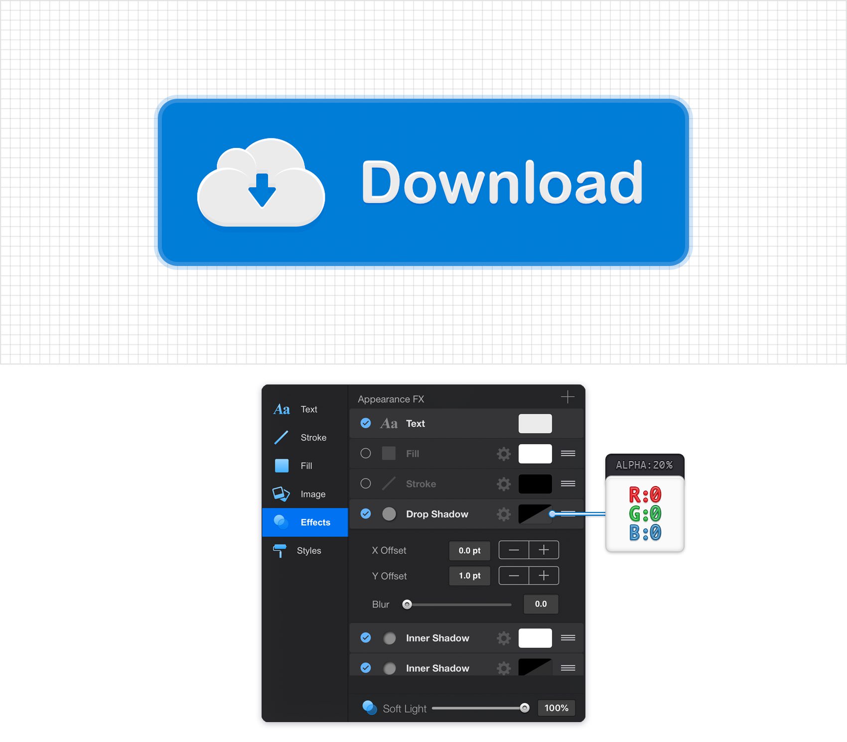
Make sure that your piece of text is still selected, keep focusing on the Effects pane and activate the Drop Shadow. Select this effect and enter the attributes shown in the following image.
Step 29
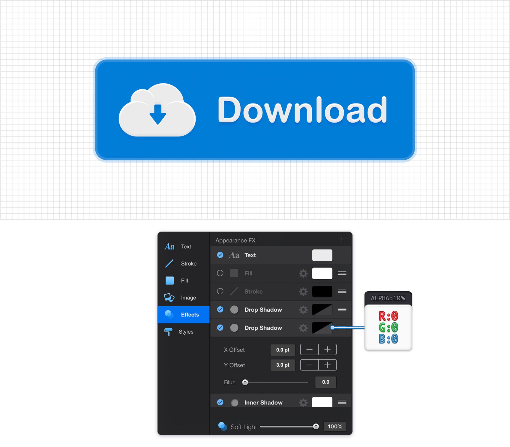
Make sure that your piece of text is still selected, keep focusing on the Effects pane and add a second Drop Shadow. Select this new effect and enter the attributes shown in the following image.
Step 30
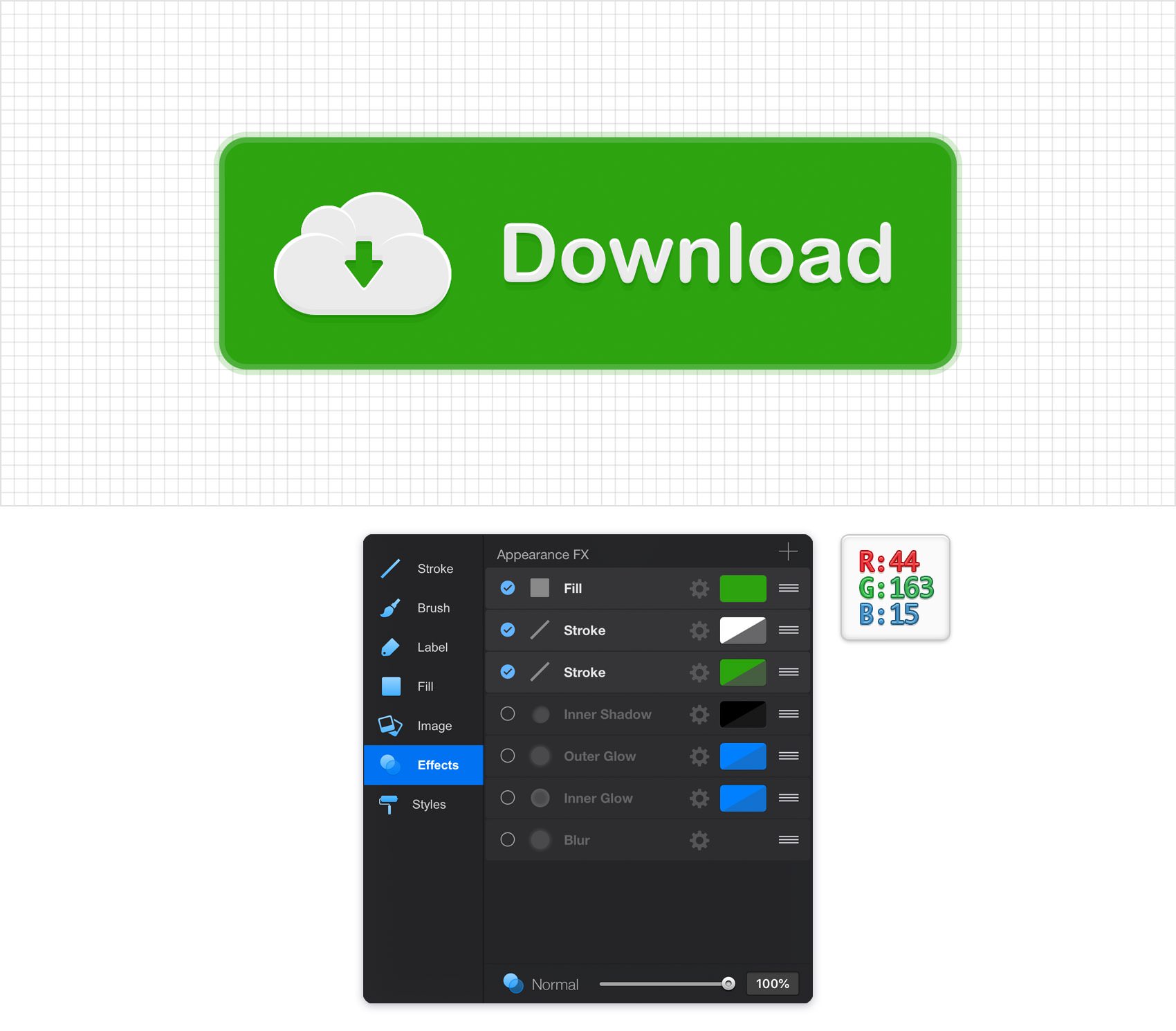
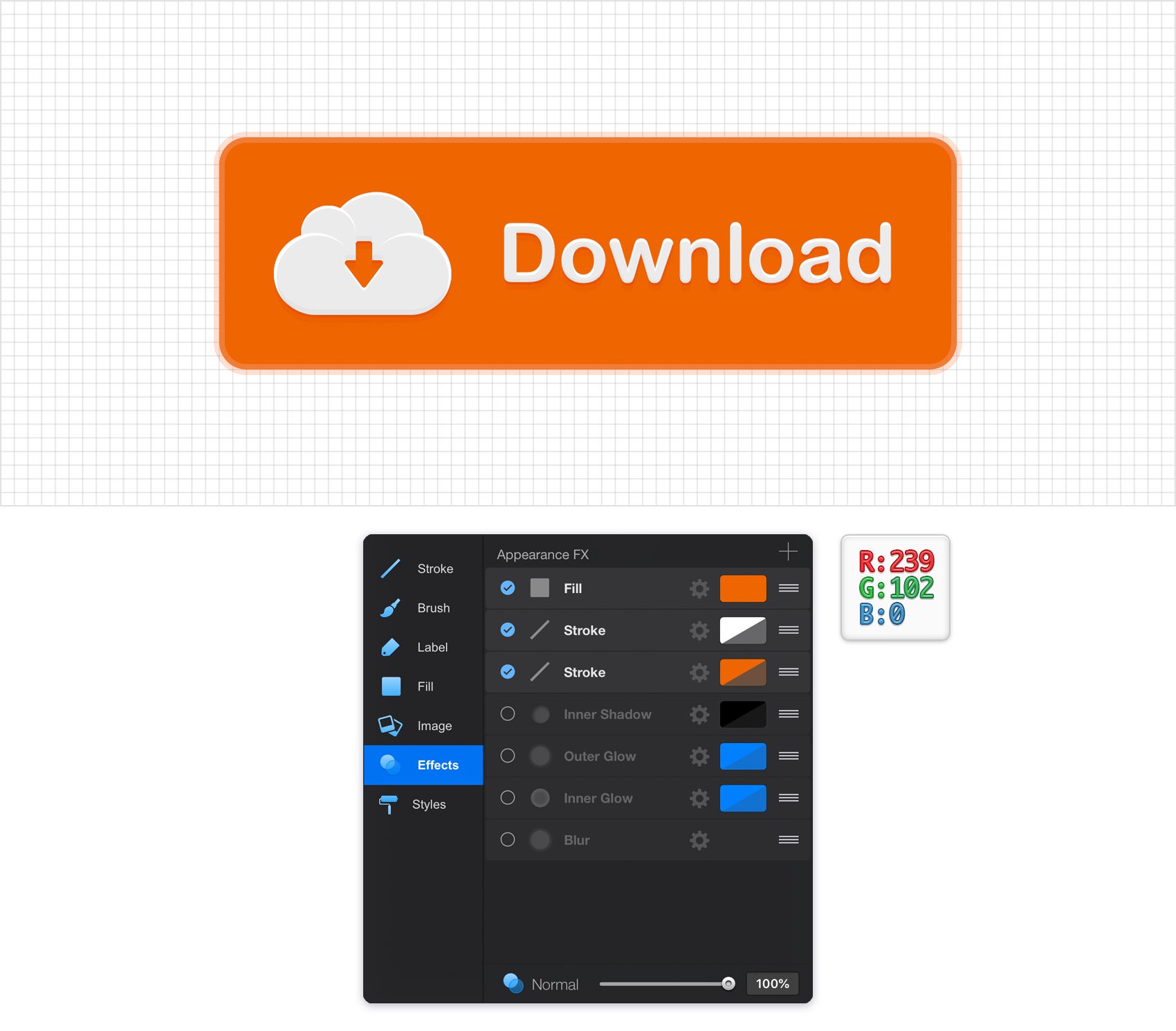
Finally, feel free to try different colors for your button. Select your blue rounded rectangle, focus on the Effects pane and replace that blue with the colors shown in the following images or any other color.
Finished Design
Congratulations, you've finished the tutorial!
Hope you've enjoyed learning some of the techniques and processes presented in these steps. As always, feel free to adjust the final design and make it your own.



Download Graphic File:
downloadbutton.idraw