


Create a Simple Switch Button
In the following tutorial you will learn how to create a simple switch button in Graphic for iPhone.
For starters you will learn how to setup a simple grid and how to create the main shapes using the Ellipse Tool and then Rounded Rectangle Tool. Next, you'll learn how to work with linear gradients and how to add shading and highlights for your shapes using some of the effects available in the Effects pane.
Finally, you''ll learn how to speed up your work using grouping techniques.
Step 1
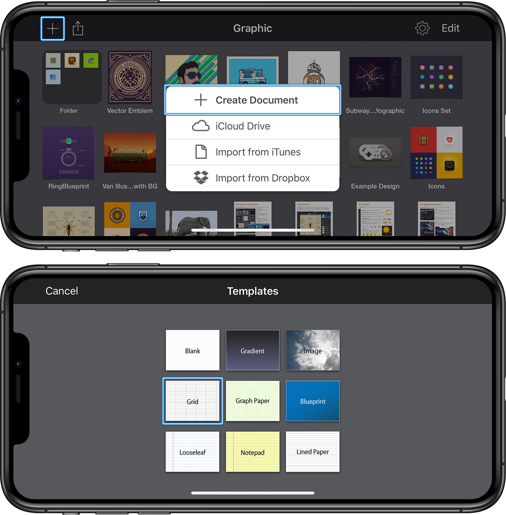
Start by tapping the plus button from the top-left corner of your screen to create a new document. Tap the Create Document button and then choose the Grid document style.
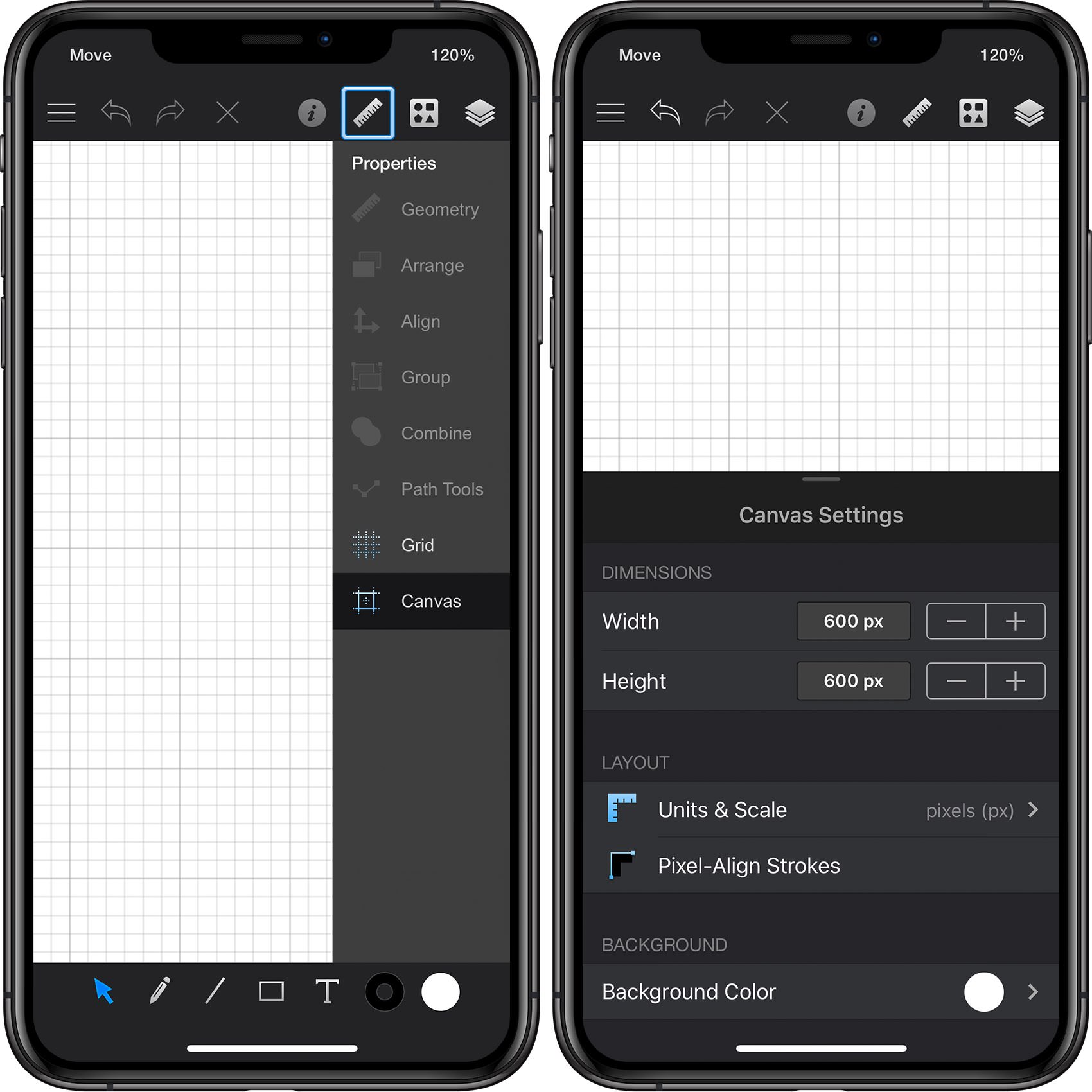
Focus on the right side of the Titlebar, tap that ruler icon to open the Properties panel and then tap the Canvas pane. Set both Width and Height to 600 px, select Pixels for the base unit, and be sure that the Pixel-Align Strokes feature is disabled.
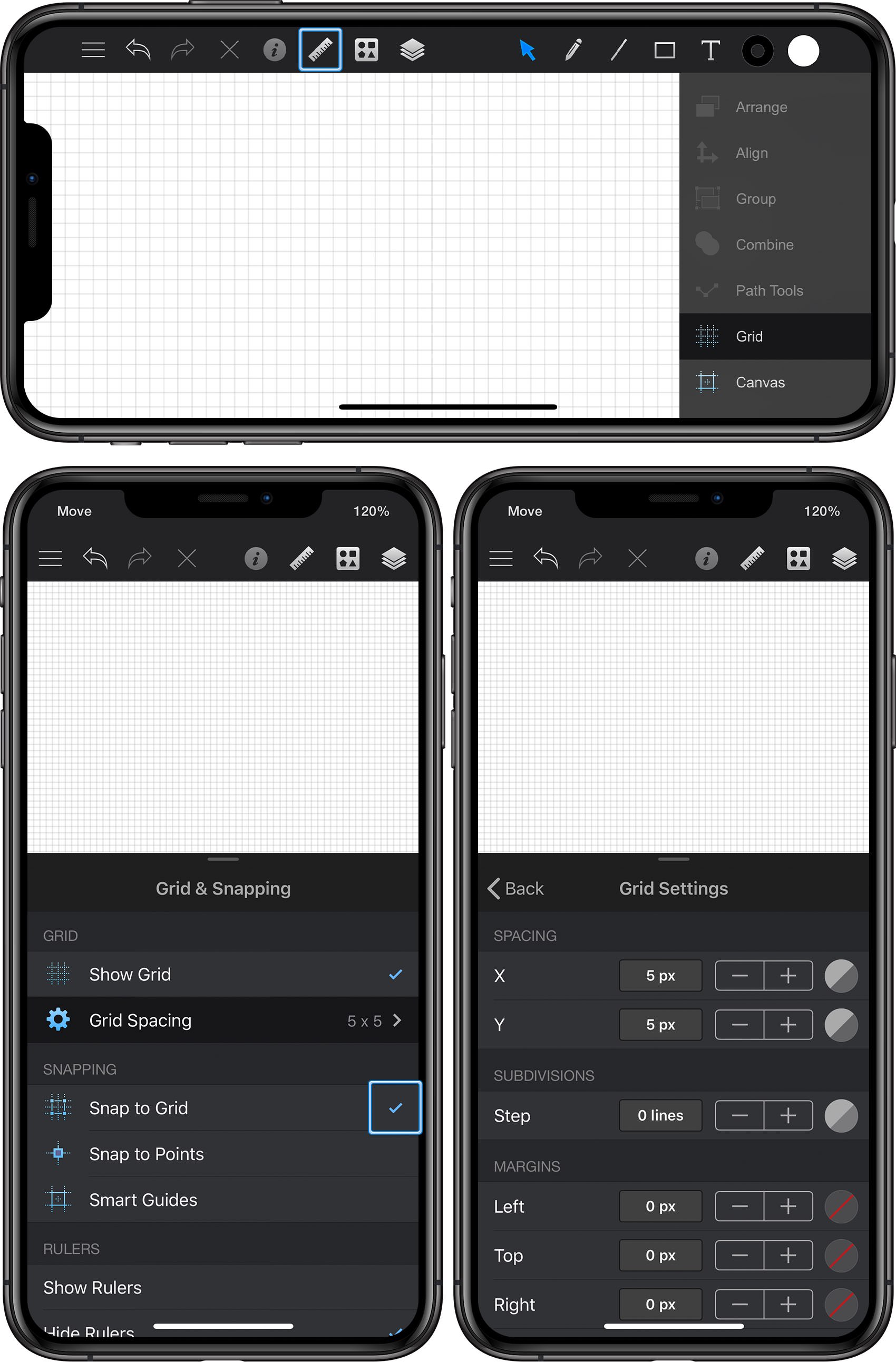
Re-open the Properties panel and this time tap the Grid pane. Make sure that the Snap to Grid feature is enabled and keep in mind that this is where you should come whenever you wish to enable or disable the grid or the Snap to Grid. Finally, open the Grid Settings pane and enter 5 px in both Spacing boxes and 0 lines in the Subdivisions box.
Step 2
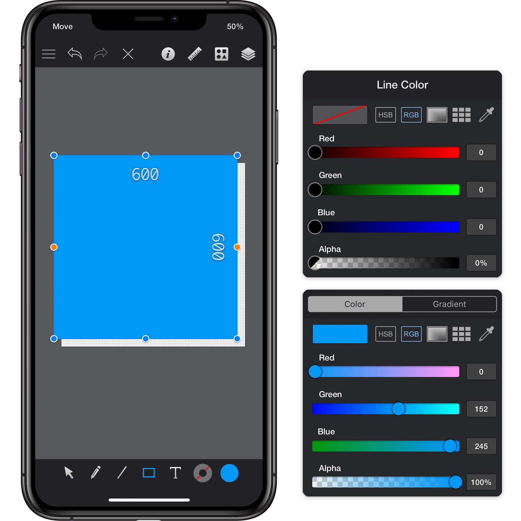
Focus on the Toolbar and notice that by default the fill color is set to white while the line color is set to black.
Tap the fill color well and set its color to R=0 G=152 B=245 and then tap the line color well. Drag the Alpha slider to 0% and this will make your line invisible. Pick the Rectangle Tool, focus on your canvas and create a 600 px square - the grid and the Snap to Grid feature will ease your work.
Step 3
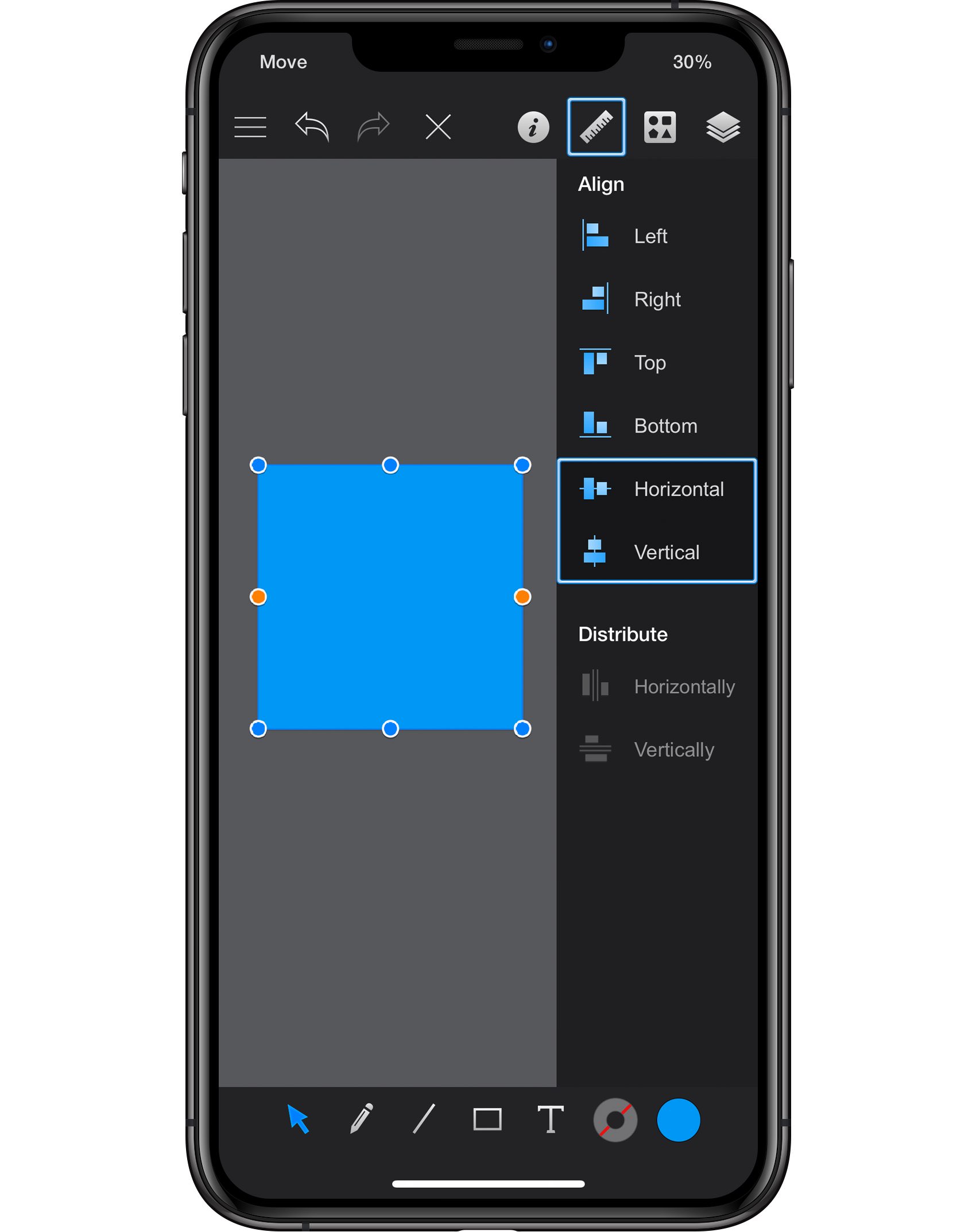
Make sure that your blue shape stays selected, focus on the right side of your Titlebar and tap that ruler icon to open the Properties panel. Go to the Align pane and tap the Horizontal and Vertical commands to bring your square in the center of the canvas.
Step 4
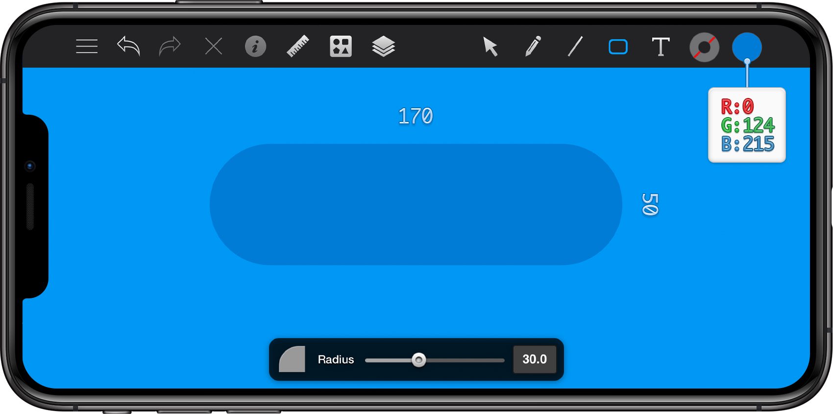
Return to your Toolbar, make sure that the Line is still invisible and then set the Fill color to R=0 G=124 B=215.
Pick the Rounded Rectangle Tool, focus on the newly opened Tool Options pane and drag the Radius slider to 30. Move to your canvas and create a 170 x 50 px.
Step 5
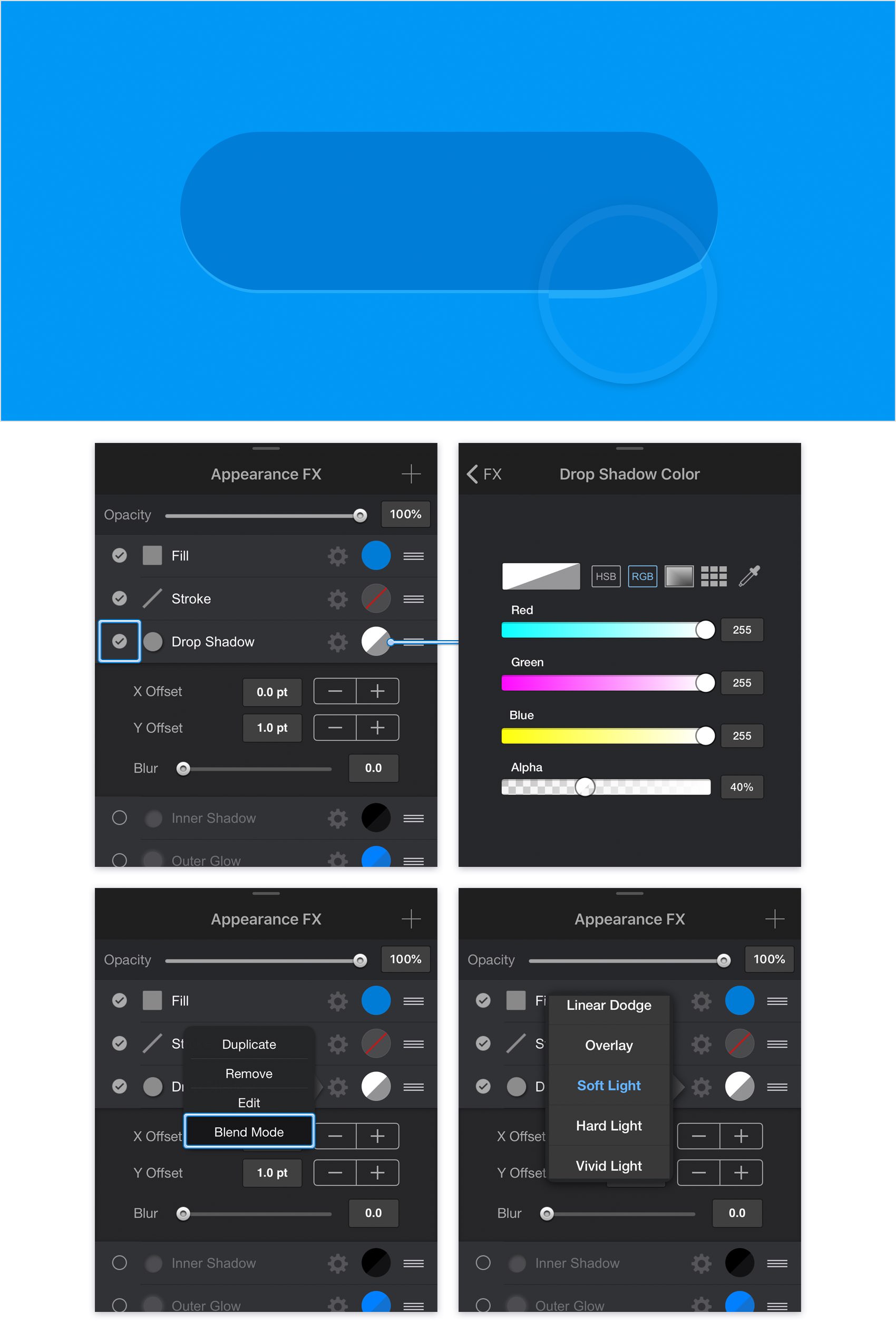
Make sure that your rounded rectangle stays selected, focus on the right side of your Titlebar and tap the leftmost icon to open the Appearance panel. Go to the Effects pane and tap the box that stands for the existing Drop Shadow to activate it.
Enter 1 in the Y box and 0 in the other two boxes and then tap the color well that stands for this effects. Drag the Alpha slider to 40% and replace the existing color with a simple white (R=255 G=255 B=255). Return to the Effects pane and tap the cogwheel icon that stands for your Drop Shadow. Tap the Blend Mode command and then select the Soft Light blend mode. In the end things should look like in the following image.
Step 6
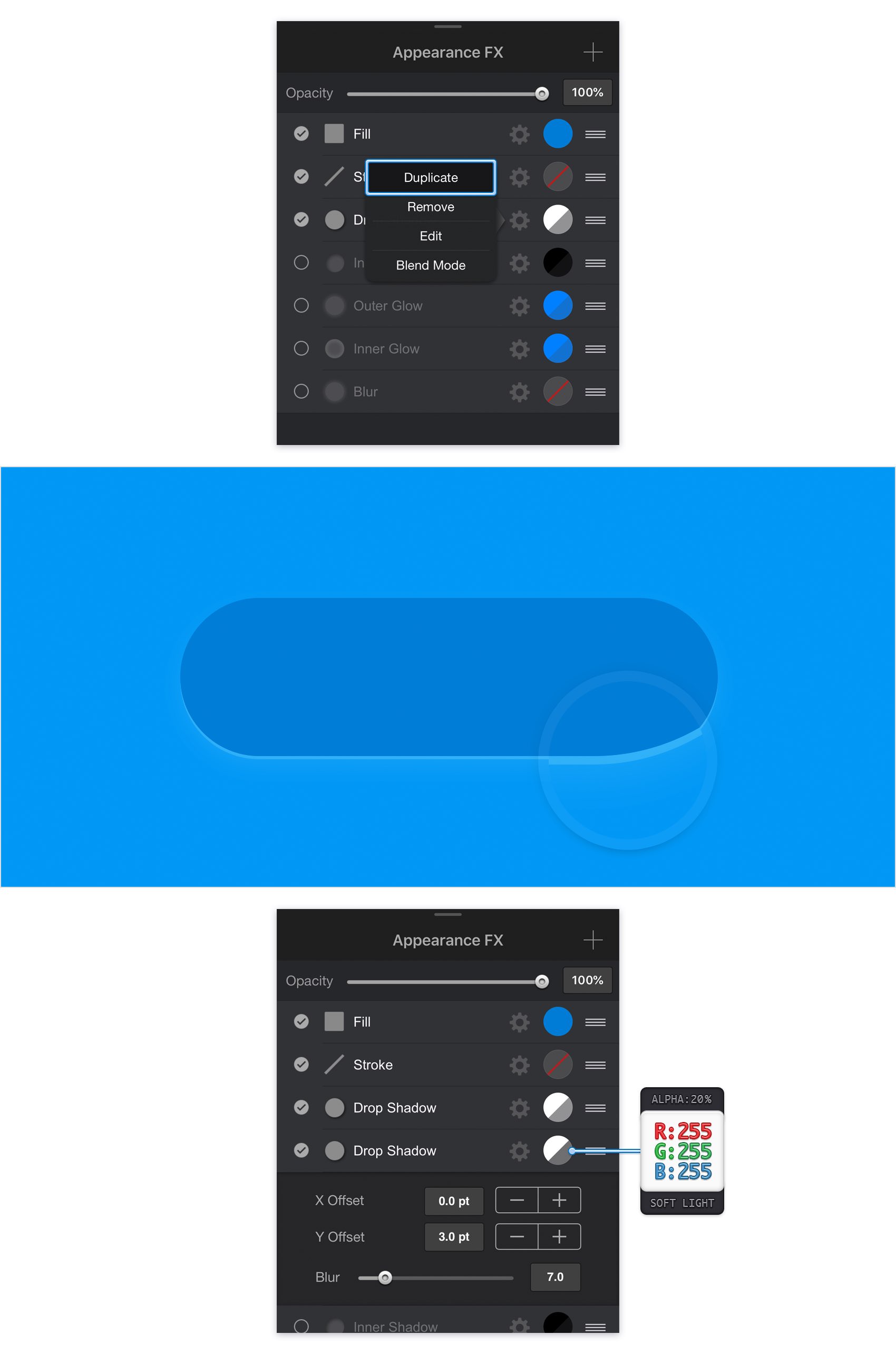
Make sure that your rounded rectangle stays selected and keep focusing on the Effects pane. Tap the cogwheel icon that stands for the existing Drop Shadow and go to Duplicate. Select the newly added effect, make sure that it lies below the existing Drop Shadow and then enter the attributes shown in the following image.
Step 7
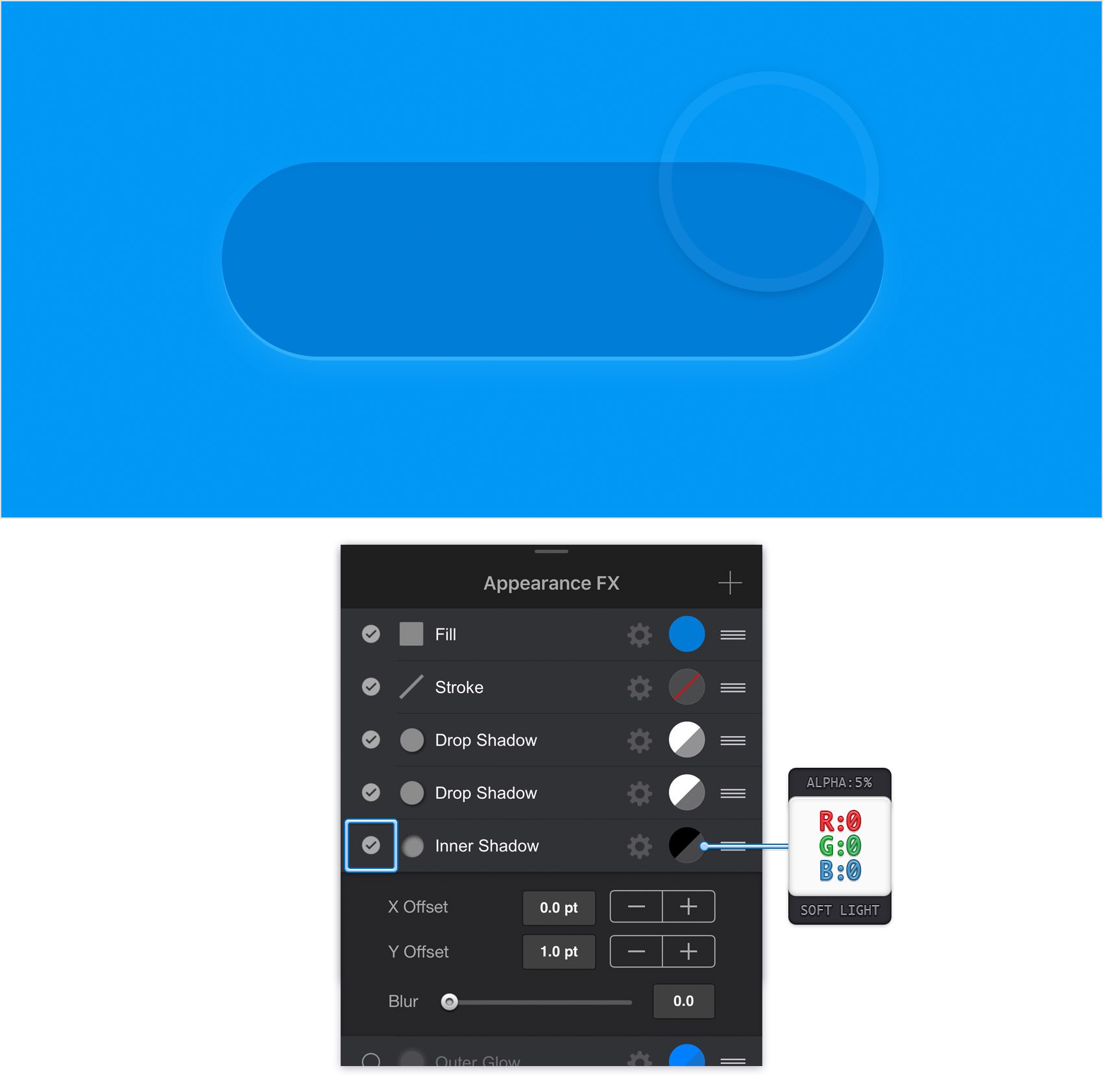
Make sure that your rounded rectangle stays selected and keep focusing on the Effects pane. Activate the existing Inner Shadow effect and enter the attributes shown in the following image.
Step 8
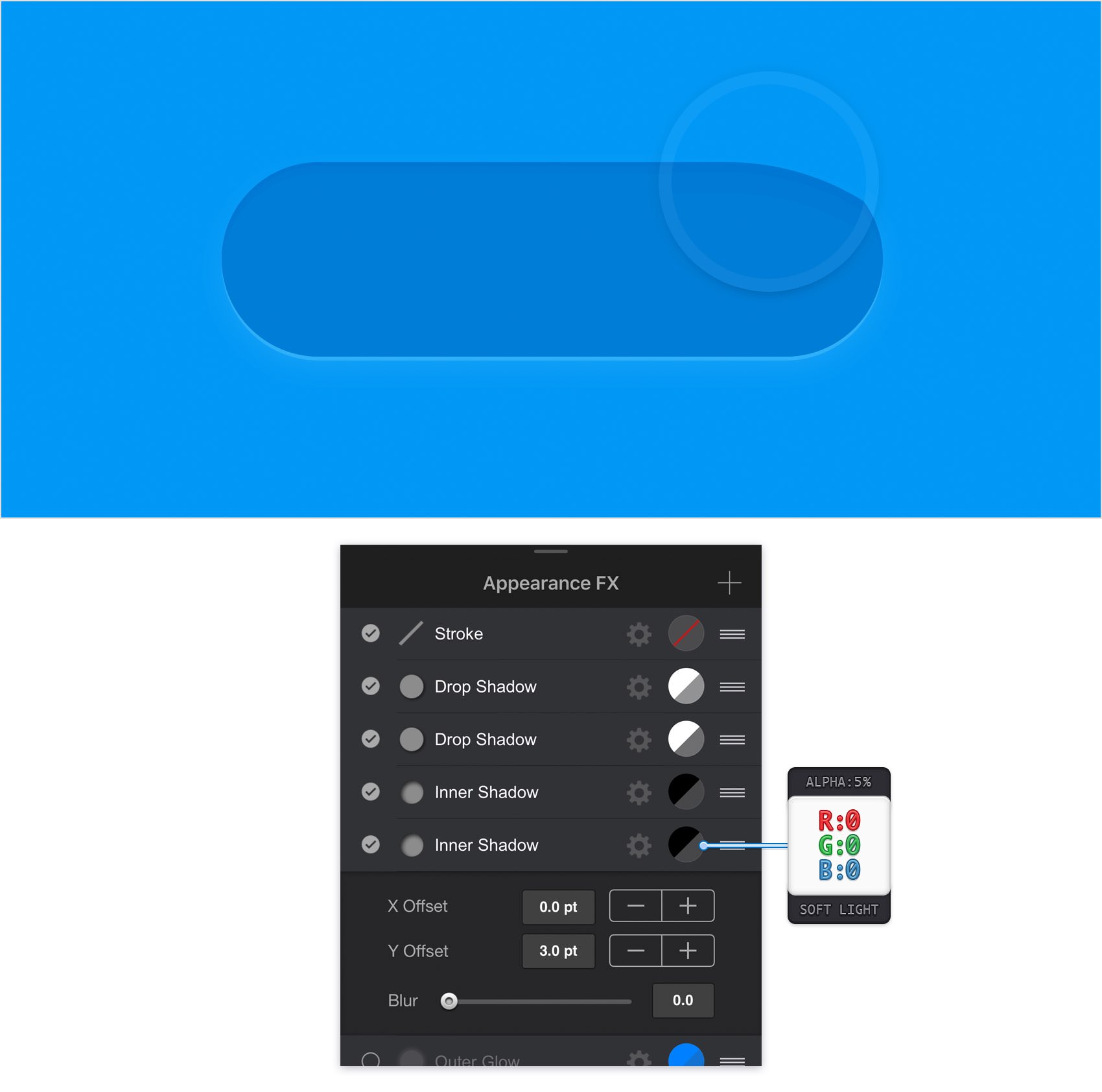
Make sure that your rounded rectangle stays selected, keep focusing on the Effects pane and duplicate the existing Inner Shadow. Select the newly added effect, drag it below the existing Inner Shadow and then enter the attributes shown in the following image.
Step 9
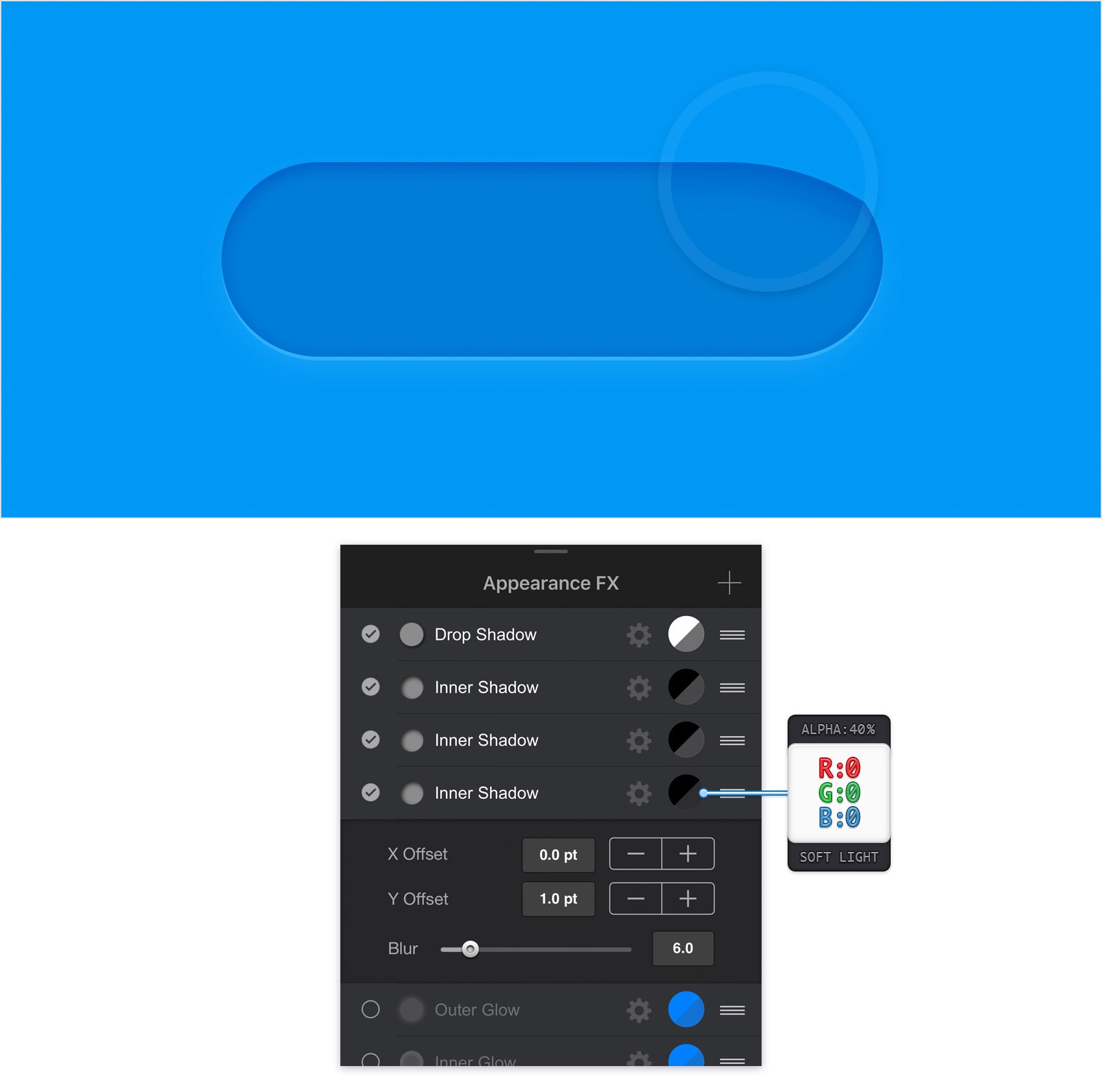
Make sure that your rounded rectangle stays selected, keep focusing on the Effects pane and duplicate the bottom Inner Shadow. Select the newly added effect, drag it below the existing Inner Shadows and then enter the attributes shown in the following image.
Step 10
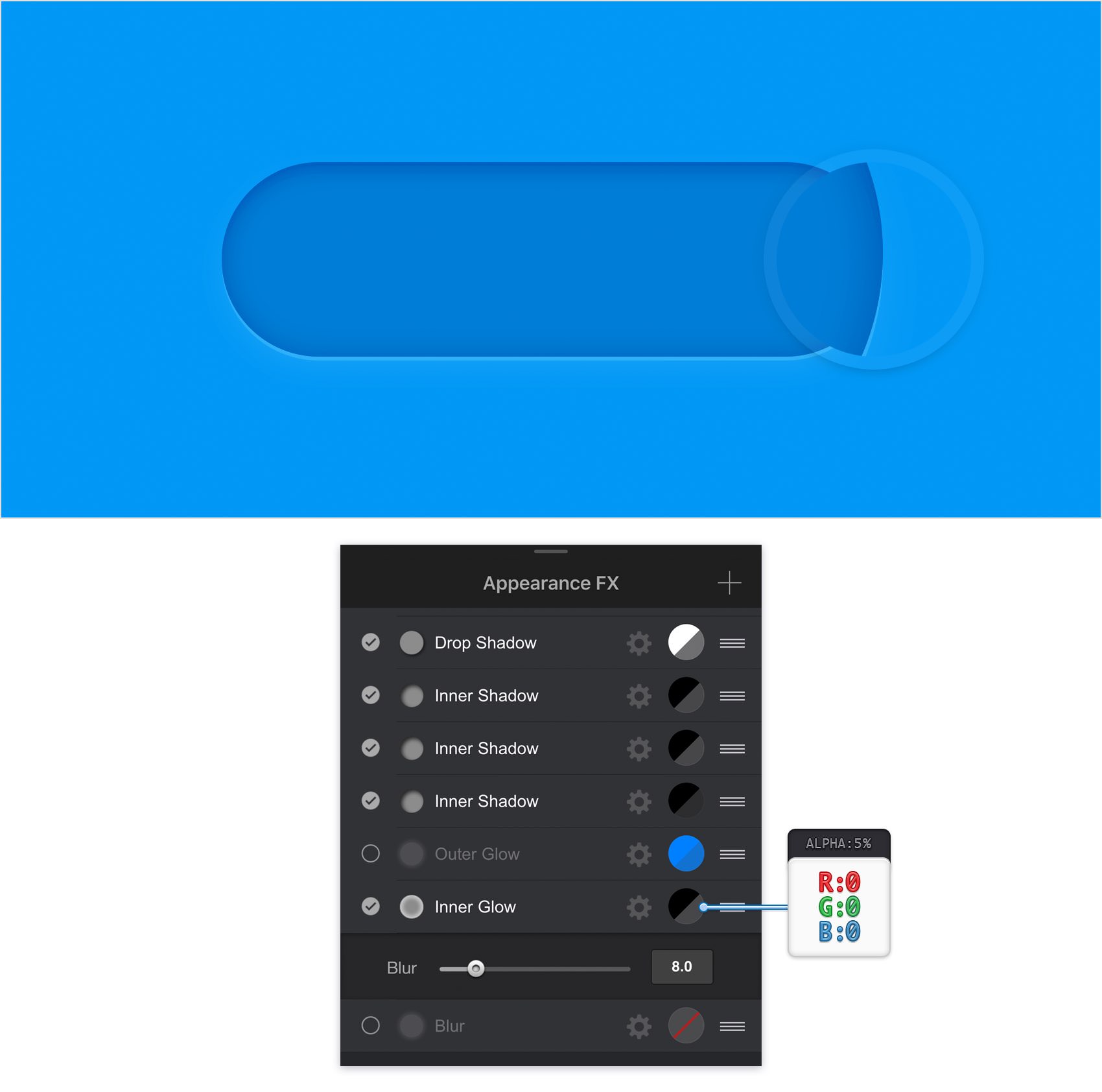
Make sure that your rounded rectangle stays selected and keep focusing on the Effects pane. Activate the existing Inner Glow and enter the attributes shown in the following image.
Step 11
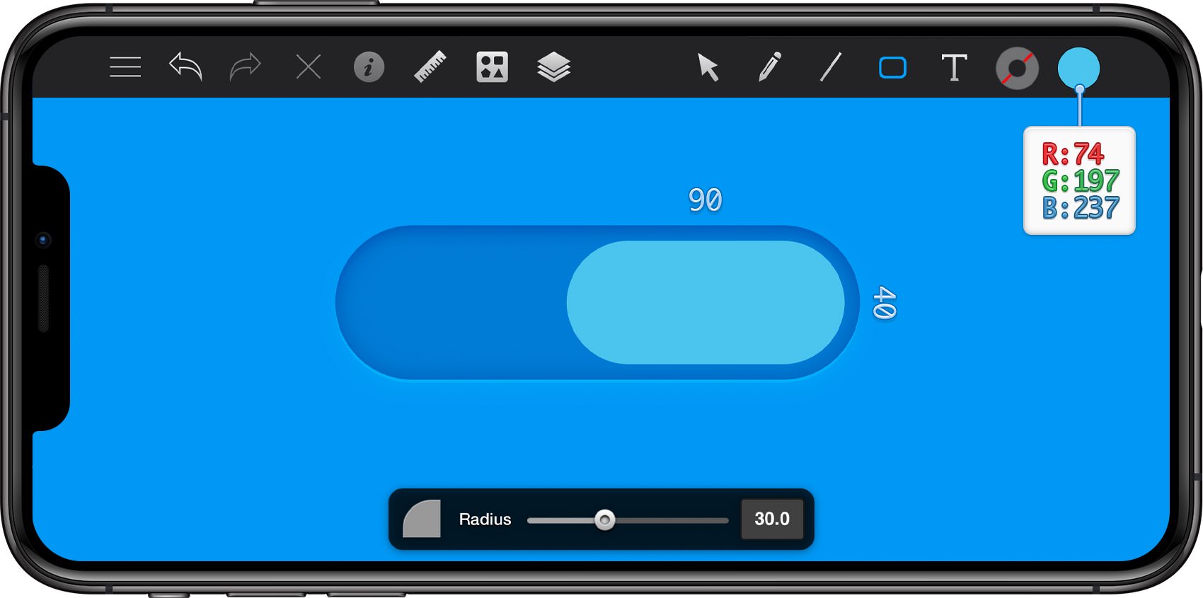
Get back to your Toolbar, make sure that the Line is invisible and then set the Fill color to R=74 G=197 B=237.
Reselect the Rounded Rectangle Tool, focus on the Tool Options pane and make sure that the Radius is set to 30 pt. Move to your canvas, create a 90 x 40 px shape and place it as shown in the following image.
Step 12
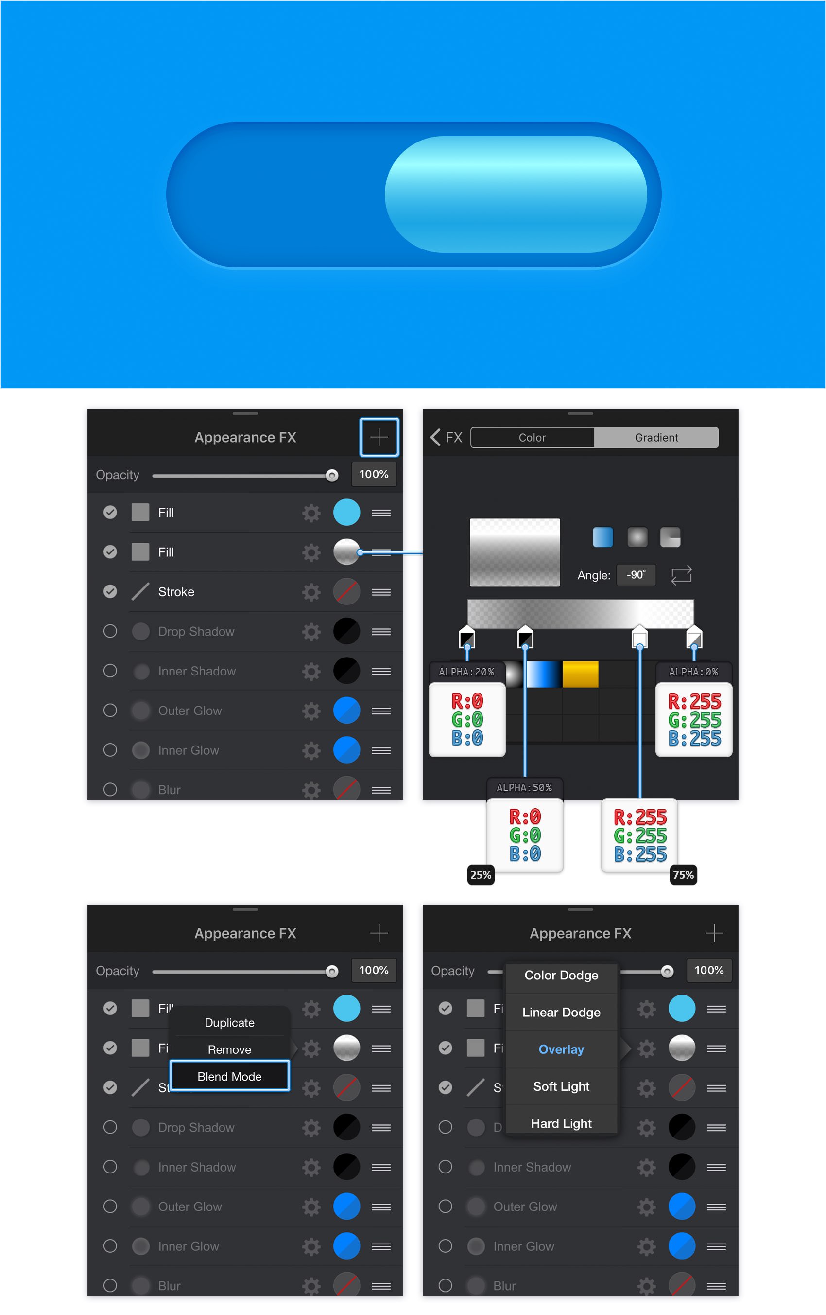
Make sure that your smaller rounded rectangle stays selected, focus on the Effects pane and add a second Fill using the plus button located in the top, right corner of the pane.
Tap the color well that stands for this new Fill and then tap the Gradient and the Linear buttons. Set the Angle to -90 degrees and then move to the gradient sliders. Select the left slider, drag the Alpha slider to 20% and set the color to black (R=0 G=0 B=0) and then select the right slider, drag the Alpha slider to 0% and set the color to white.
Now, tap on the gradient bar to add a new gradient slider. Select it, set the color to black and the Alpha to 50% and then drag it to the left until the Location tooltip shows 25%. Add a fourth gradient slider, make it white and set the Location to 75%. Return to the Effects pane, keep focusing on the Fill added in this step and change its Blend Mode to Overlay.
Step 13
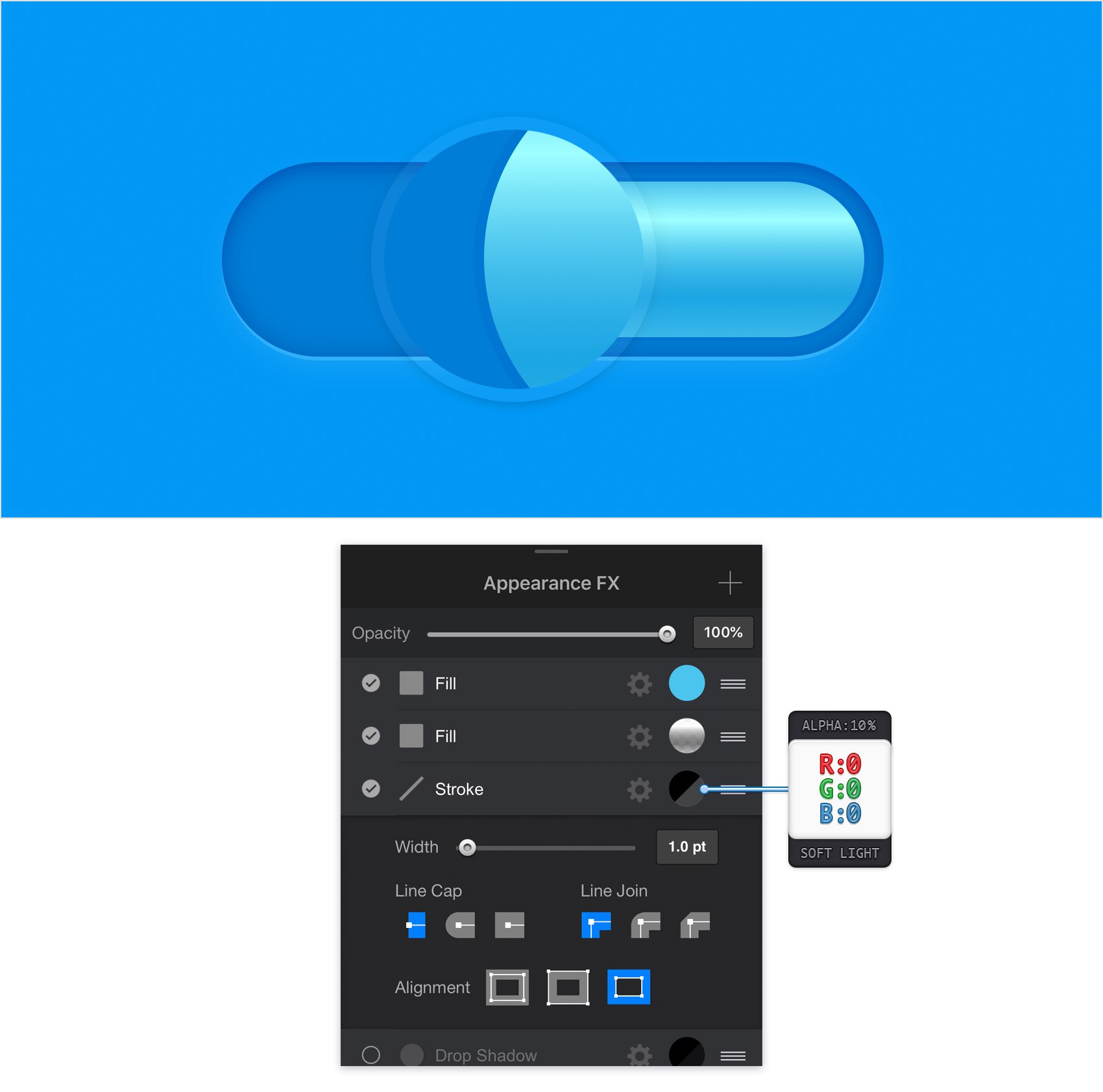
Make sure that your smaller rounded rectangle stays selected and focus on the Effects pane. Select the Stroke and replace the existing attributes with the ones shown in the following image.
Step 14
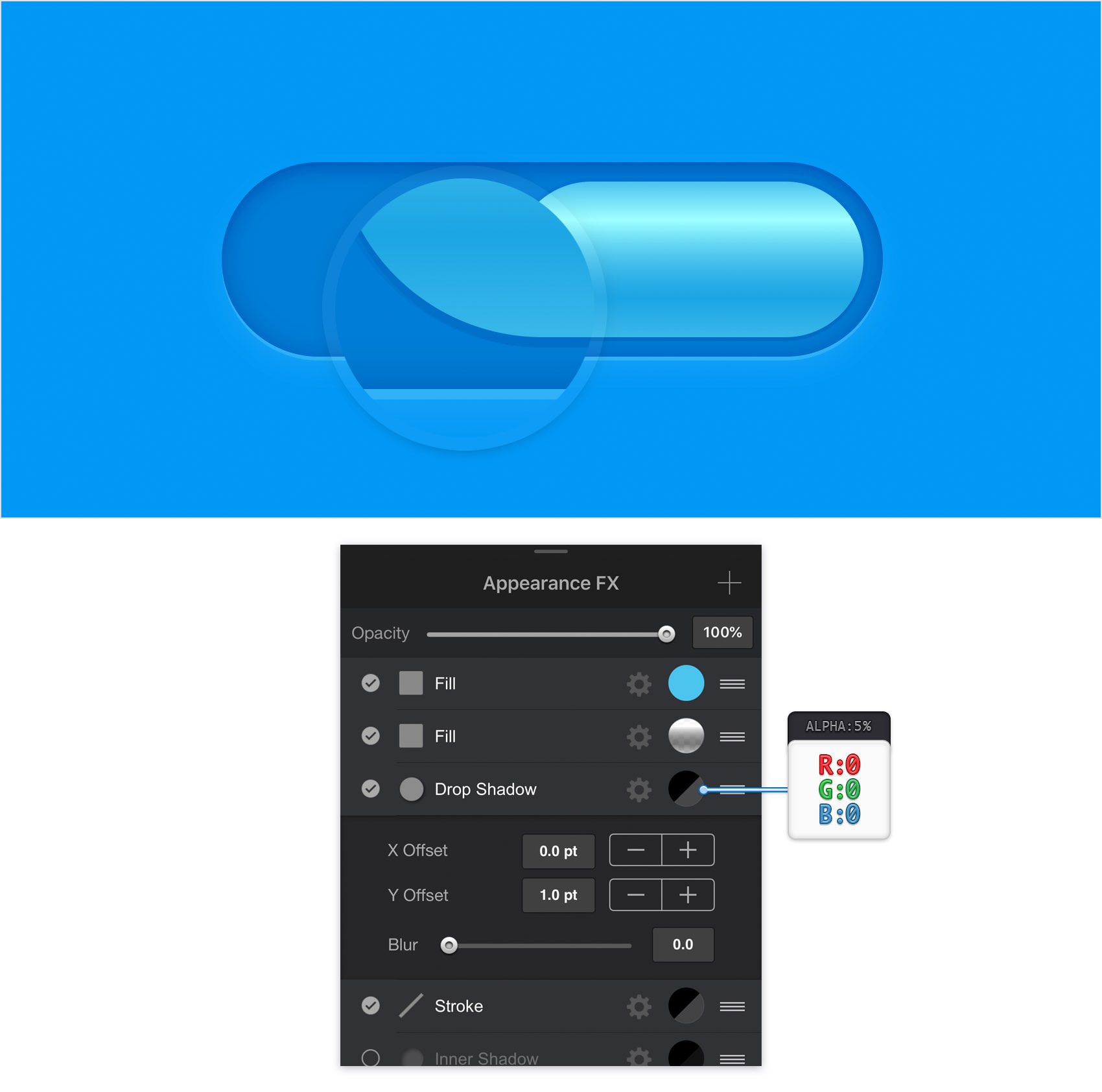
Make sure that your smaller rounded rectangle stays selected and keep focusing on the Effects ** pane. Activate the existing Drop Shadow, drag it above the Stroke** and then enter the attributes shown in the following image.
Step 15
Make sure that your smaller rounded rectangle stays selected, keep focusing on the Effects ** pane and add a second Drop Shadow. Select this new effect, drag it below the existing Drop Shadow** and then enter the attributes shown in the following image.
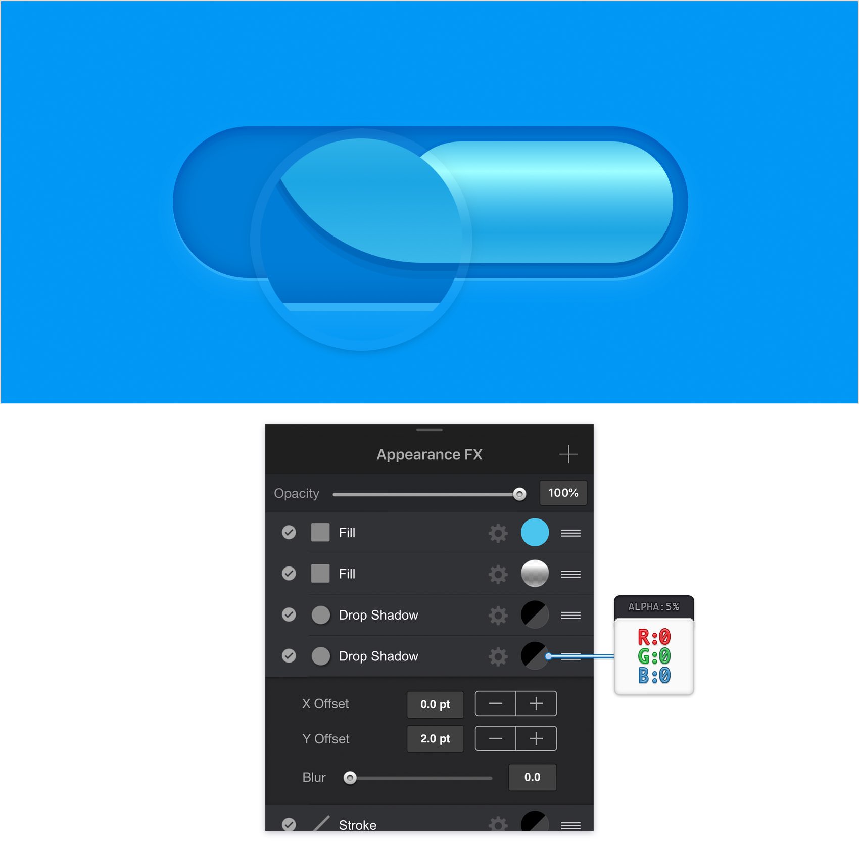
Step 16
Make sure that your smaller rounded rectangle stays selected, keep focusing on the Effects pane and add a third Drop Shadow. Select this new effect, drag it below the existing Drop Shadows and then enter the attributes shown in the following image.
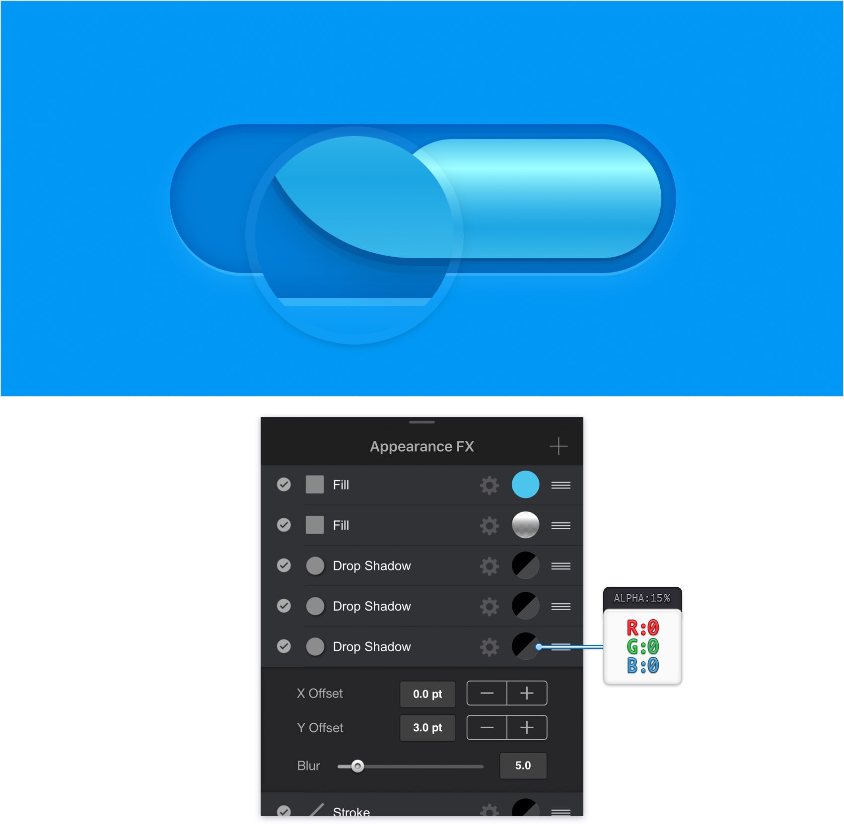
Step 17
Make sure that your smaller rounded rectangle stays selected, keep focusing on the Effects pane and activate the existing Inner Shadow. Select this new effect, drag it below the bottom Drop Shadow and then enter the attributes shown in the following image.
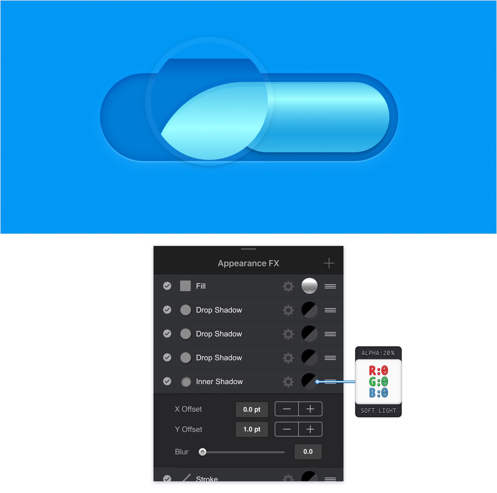
Step 18
Make sure that your smaller rounded rectangle stays selected, keep focusing on the Effects pane and add a second Inner Shadow. Select this new effect, drag it below the existing Inner Shadow and then enter the attributes shown in the following image.
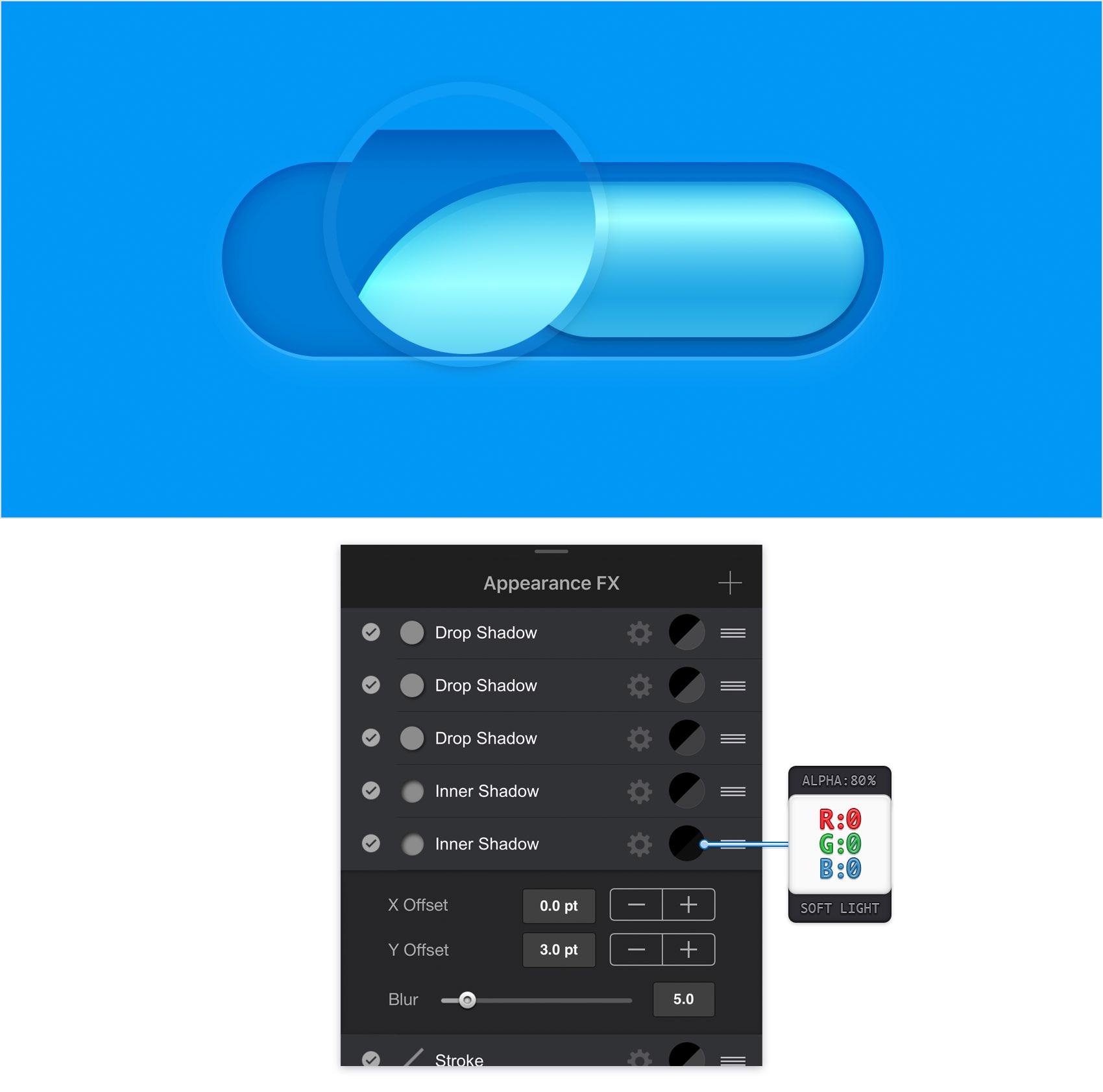
Step 19
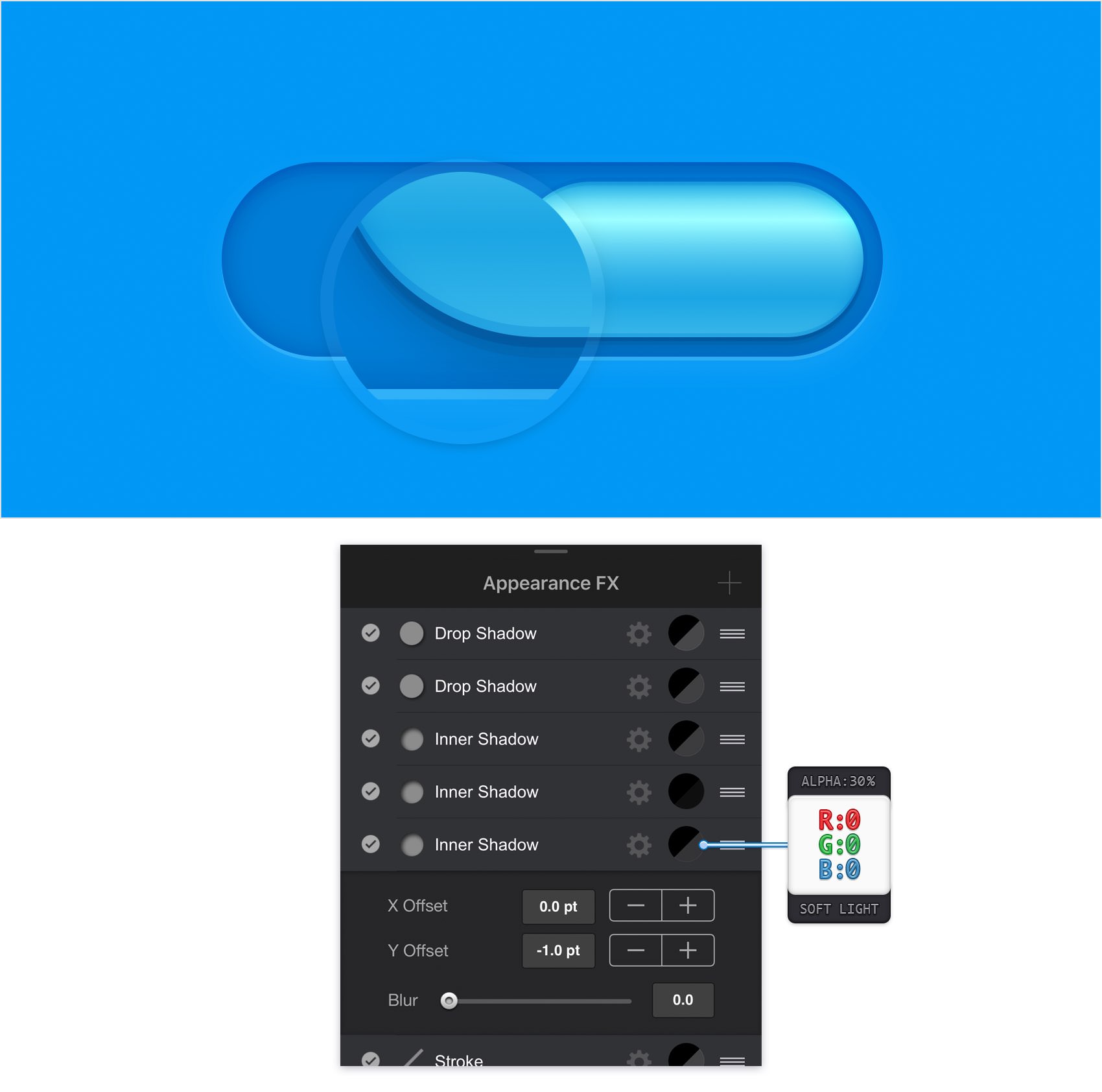
Make sure that your smaller rounded rectangle stays selected, keep focusing on the Effects pane and add a third Inner Shadow. Select this new effect, drag it below the existing Inner Shadows and then enter the attributes shown in the following image.
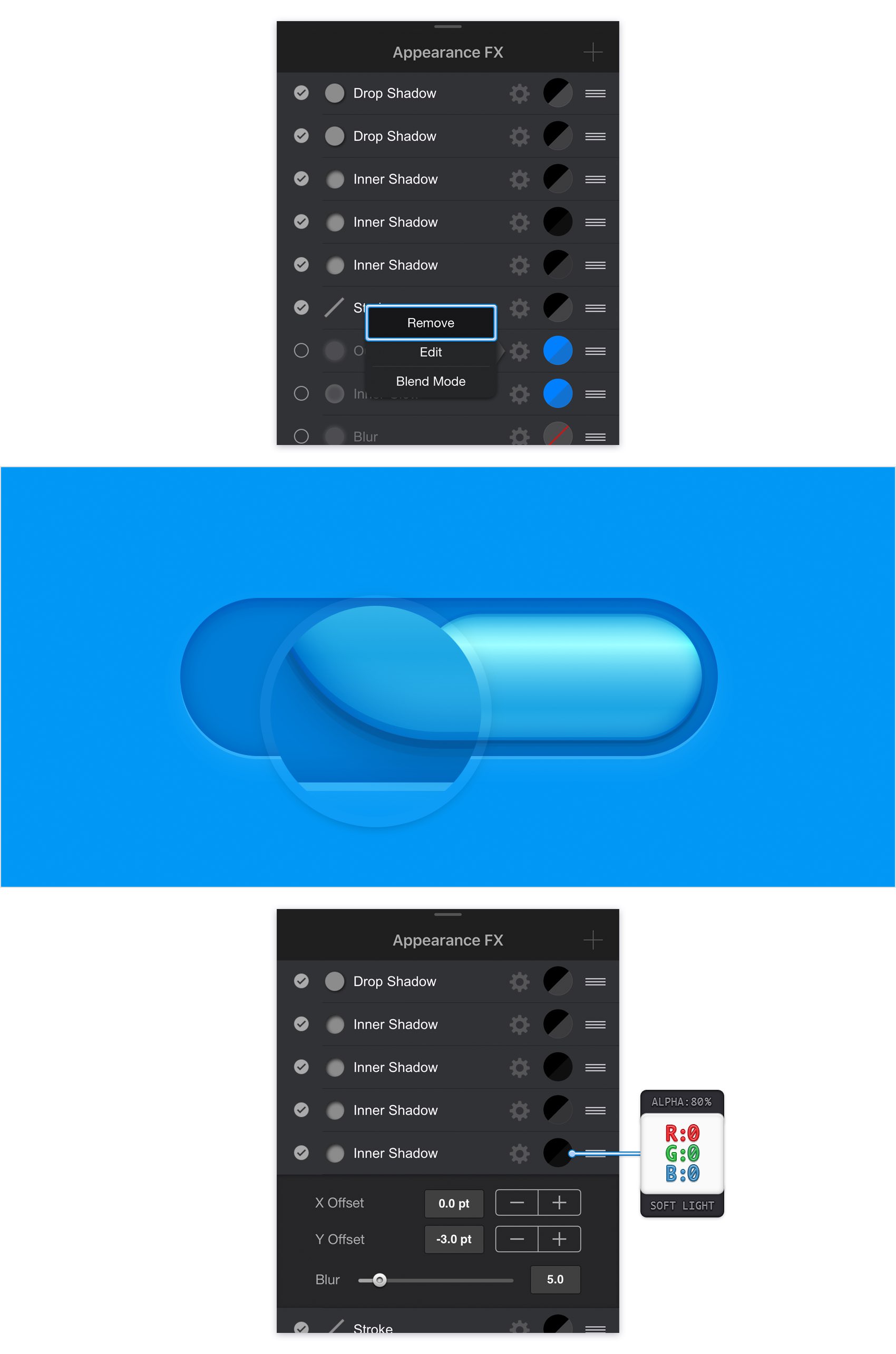
Step 20
First, you need to remove one of those inactive effects because you've reached the limit of twelve effects, strokes and fills for one shape. Simply tap the cogwheel icon that stands for that Outer Glow effect and then tap the Remove command.
Make sure that your smaller rounded rectangle stays selected, keep focusing on the Effects pane and add a fourth Inner Shadow. Select this new effect, drag it below the existing Inner Shadows and then enter the attributes shown in the following image.
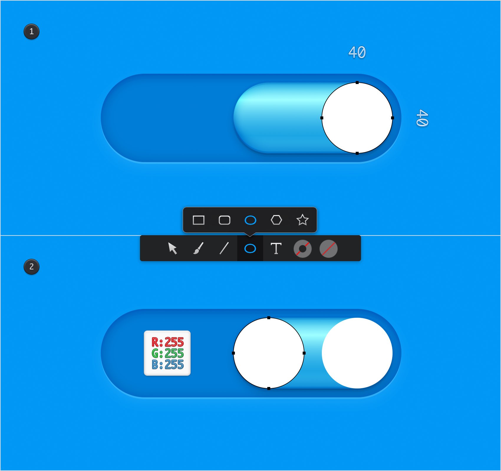
Step 21
Return to your Toolbar, make sure that the Line is invisible and then set the Fill color to white. Using the Ellipse Tool, create a 40 px circle and place it as shown in the first image. Create a second, 40 px circle and place it as shown in the second image.
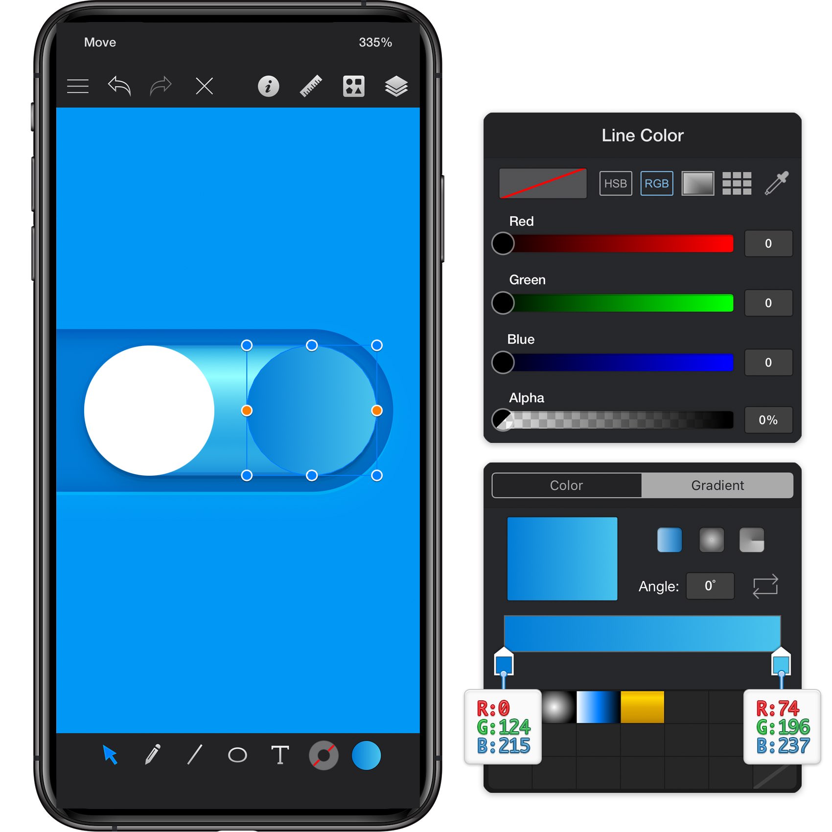
Step 22
Select your right, white circle and focus on the Effects pane. Select the existing Fill and replace the flat color with the linear gradient shown in the following image. Make sure that you're setting the Angle to -45 degrees.
Step 23
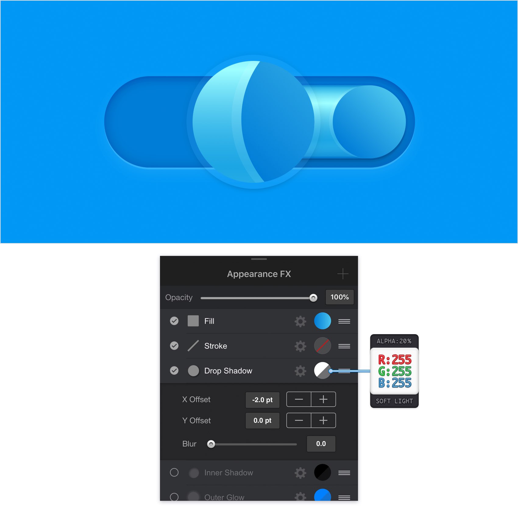
Make sure that your right circle stays selected and keep focusing on the Effects pane. Activate the existing Drop Shadow and enter the attributes shown in the following image.
Step 24
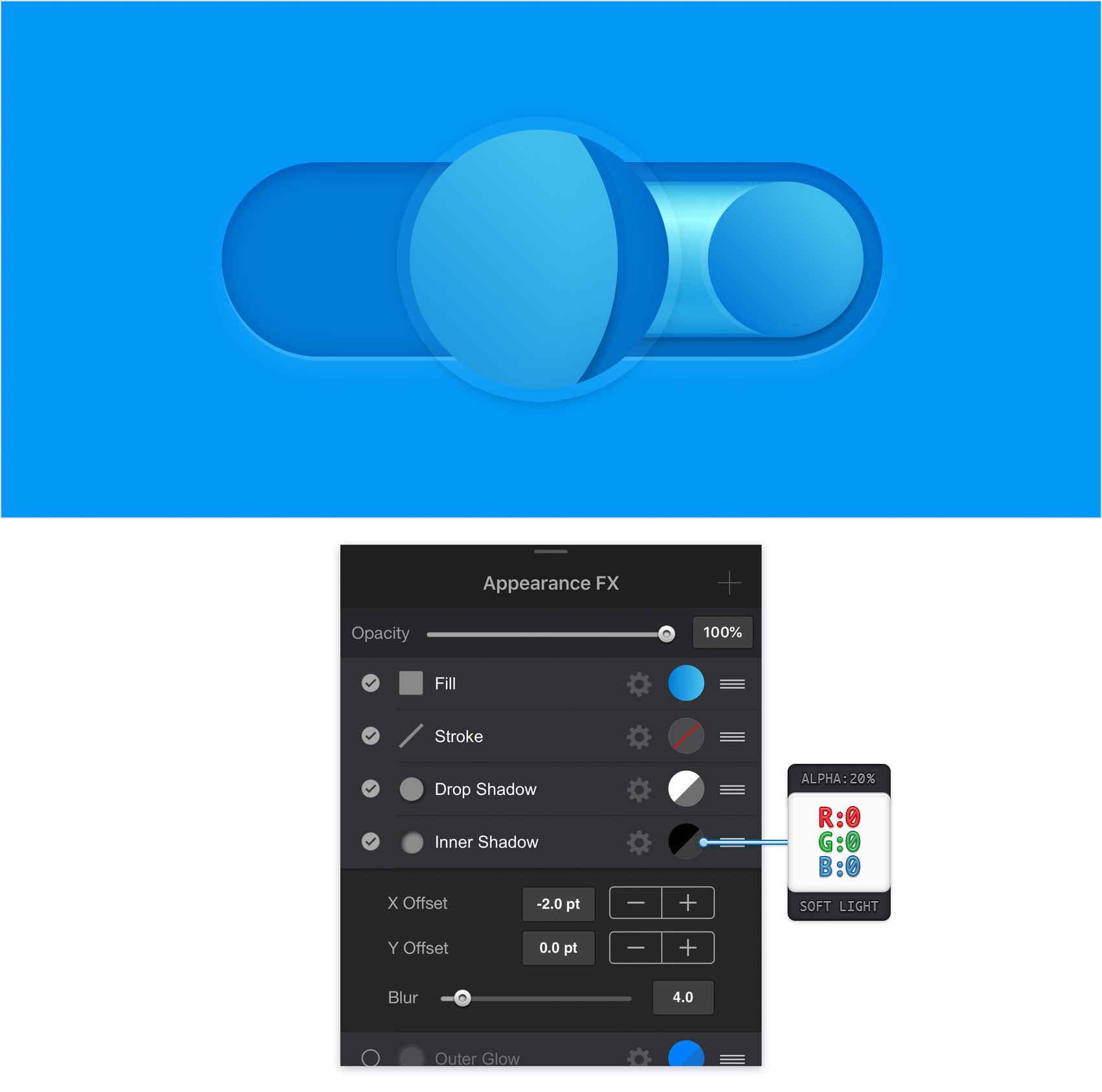
Make sure that your right circle stays selected and keep focusing on the Effects pane. Activate the existing Inner Shadow and enter the attributes shown in the following image.
Step 25
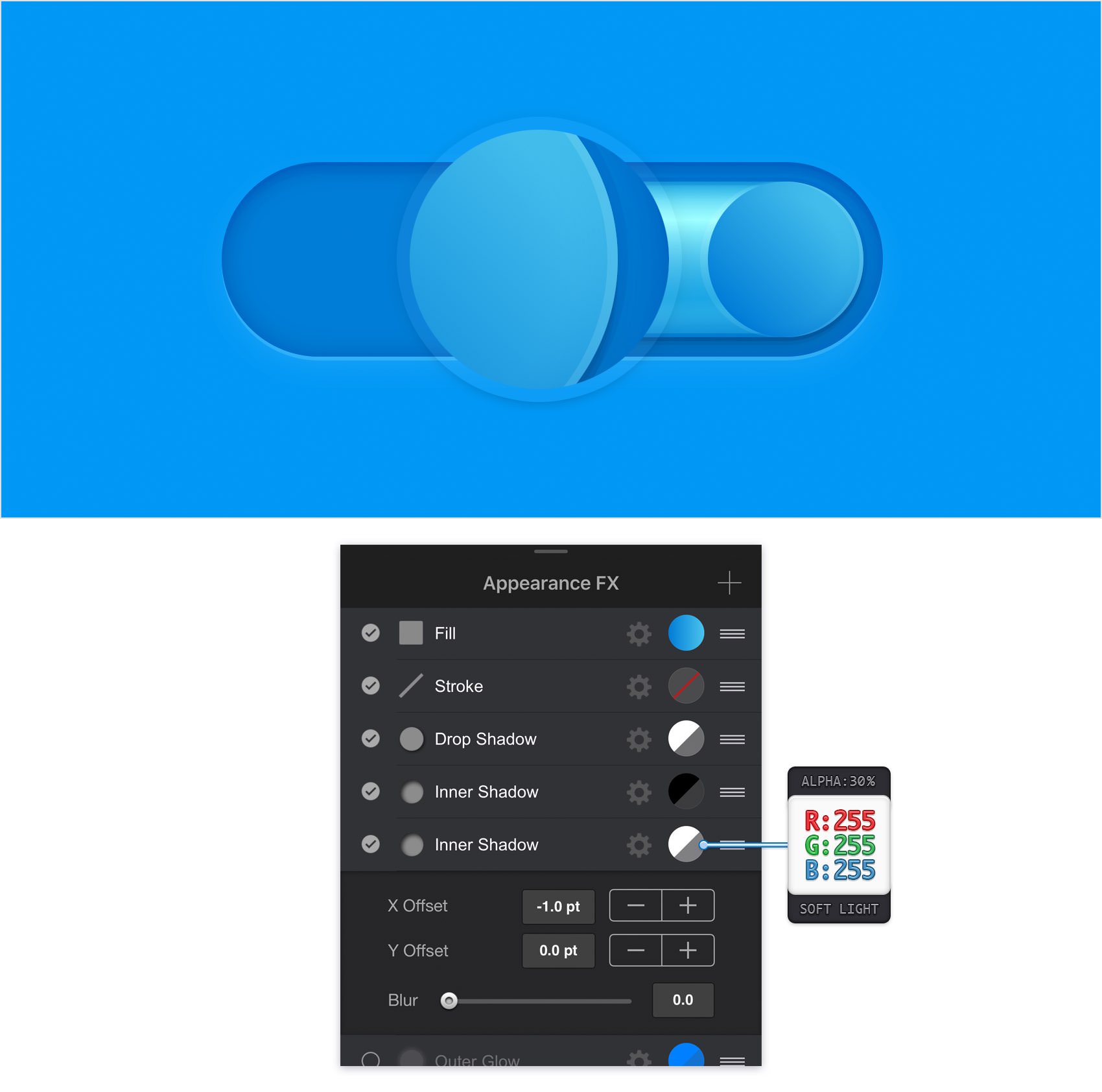
Make sure that your right circle stays selected, keep focusing on the Effects pane and add a second Inner Shadow. Select this new effect, make sure that it lies below the existing Inner Shadow and then enter the attributes shown in the following image.
Step 26
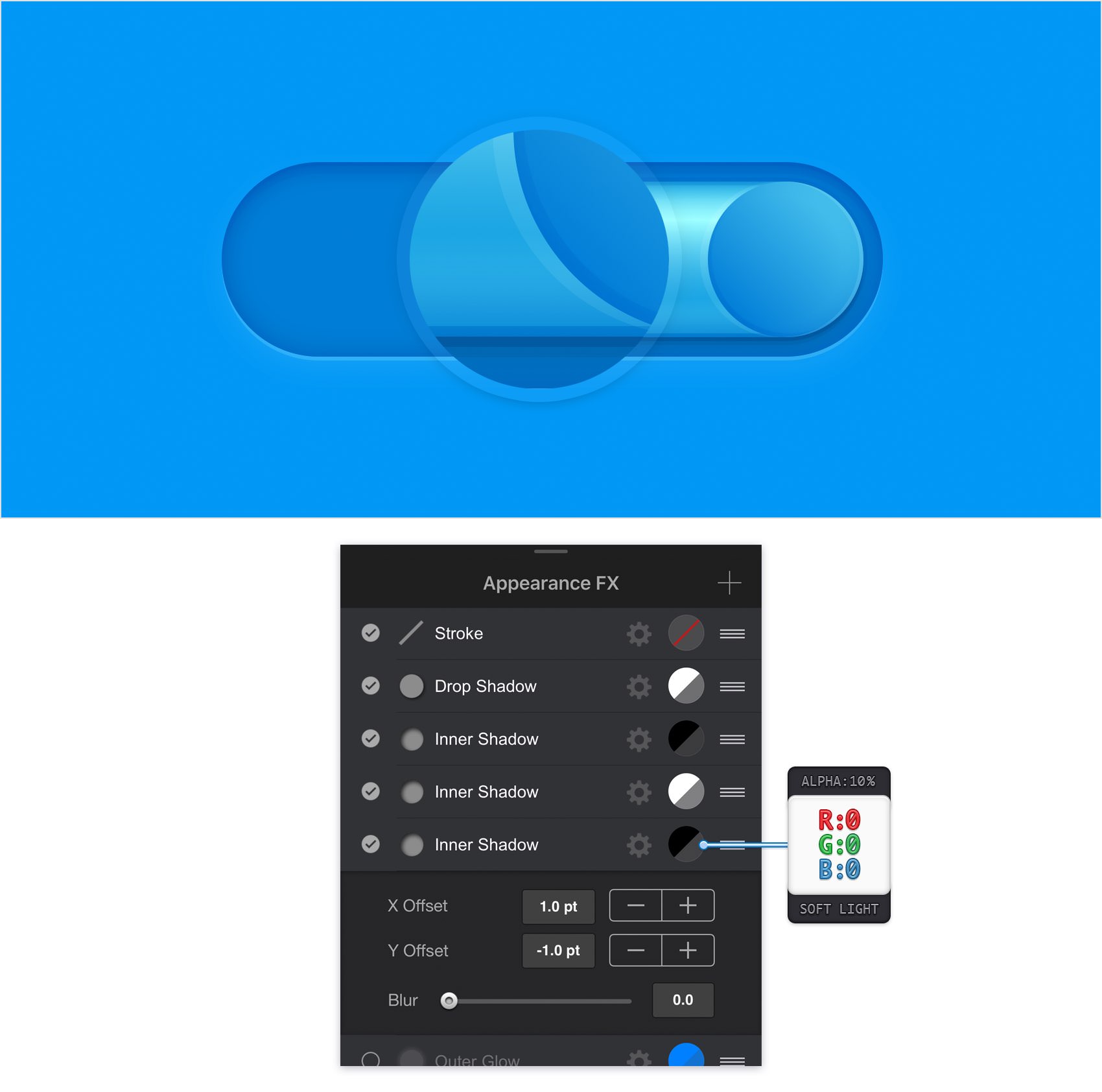
Make sure that your right circle stays selected, keep focusing on the Effects pane and add a third Inner Shadow. Select this new effect, make sure that it lies below the existing Inner Shadows and then enter the attributes shown in the following image.
Step 27
Make sure that your right circle stays selected, keep focusing on the Effects pane and add a fourth Inner Shadow. Select this new effect, make sure that it lies below the existing Inner Shadows and then enter the attributes shown in the following image.
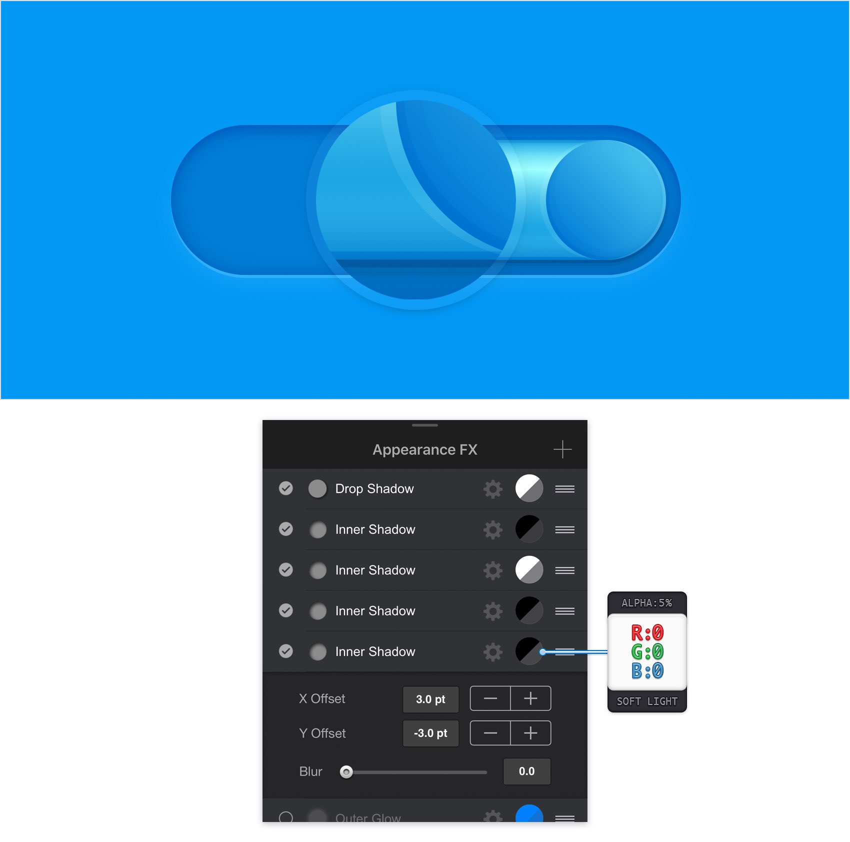
Step 28
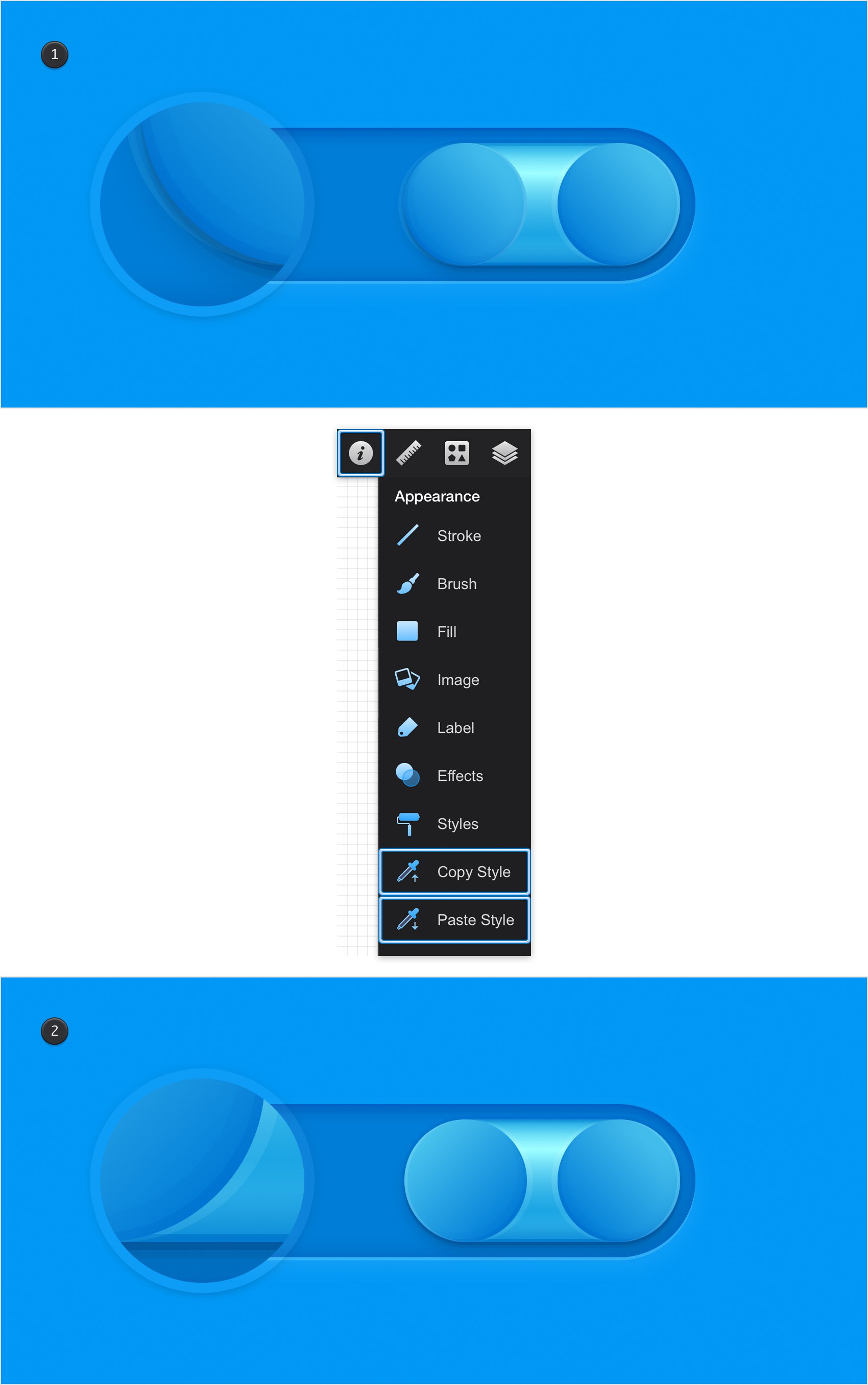
Make sure that your right circle stays selected open the Appearance panel and tap the Copy Style command. Select your left circle, return to that Appearance panel and this time tap the Paste Style command.
Make sure that your left circle stays selected and focus on the Effects pane. Select the existing effects one by one and inverse the values used in the X boxes. Do the same for that gradient angle. In the end things should look like in the second image.
Step 29
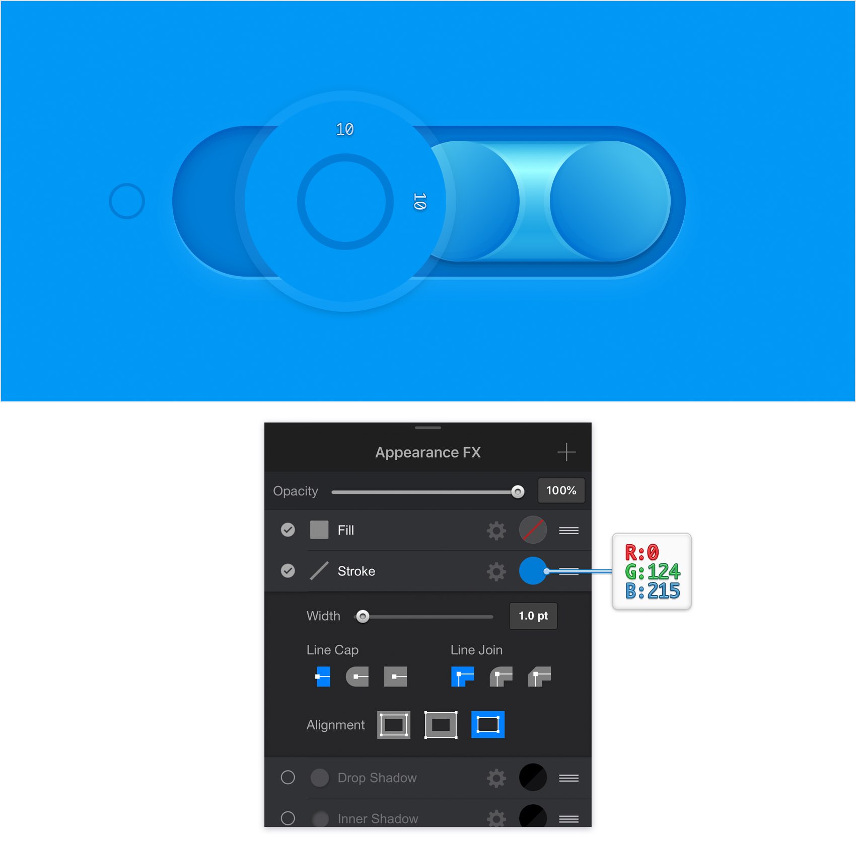
Get back to your Toolbar, but this time make the Fill invisible and set the Line color to R=0 G=124 B=215.
Using the Ellipse Tool, create a 10 px circle and place it as shown in the following image. Make sure that this shape stays selected and focus on the Effects pane. Select the Stroke, make sure that the Width slider is set to 1 pt and select the Outside Alignment button.
Step 30
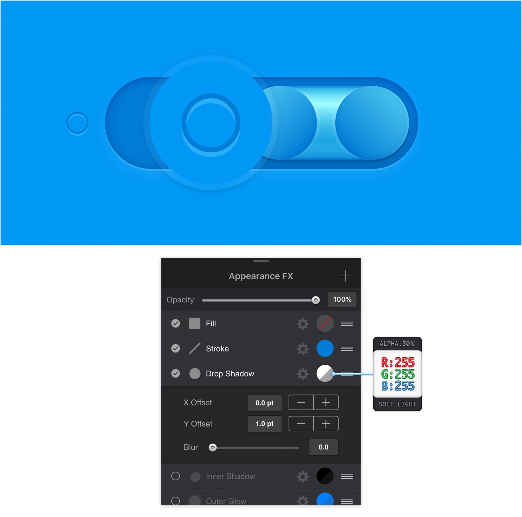
Make sure that your 10 px circle stays selected, focus on the Effects pane, activate the existing Drop Shadow and then enter the attributes shown in the following image.
Step 31
Make sure that your 10 px circle stays selected and focus on the Effects pane. Activate the existing Inner Shadow, drag it above the Drop Shadow and then enter the attributes shown in the following image.
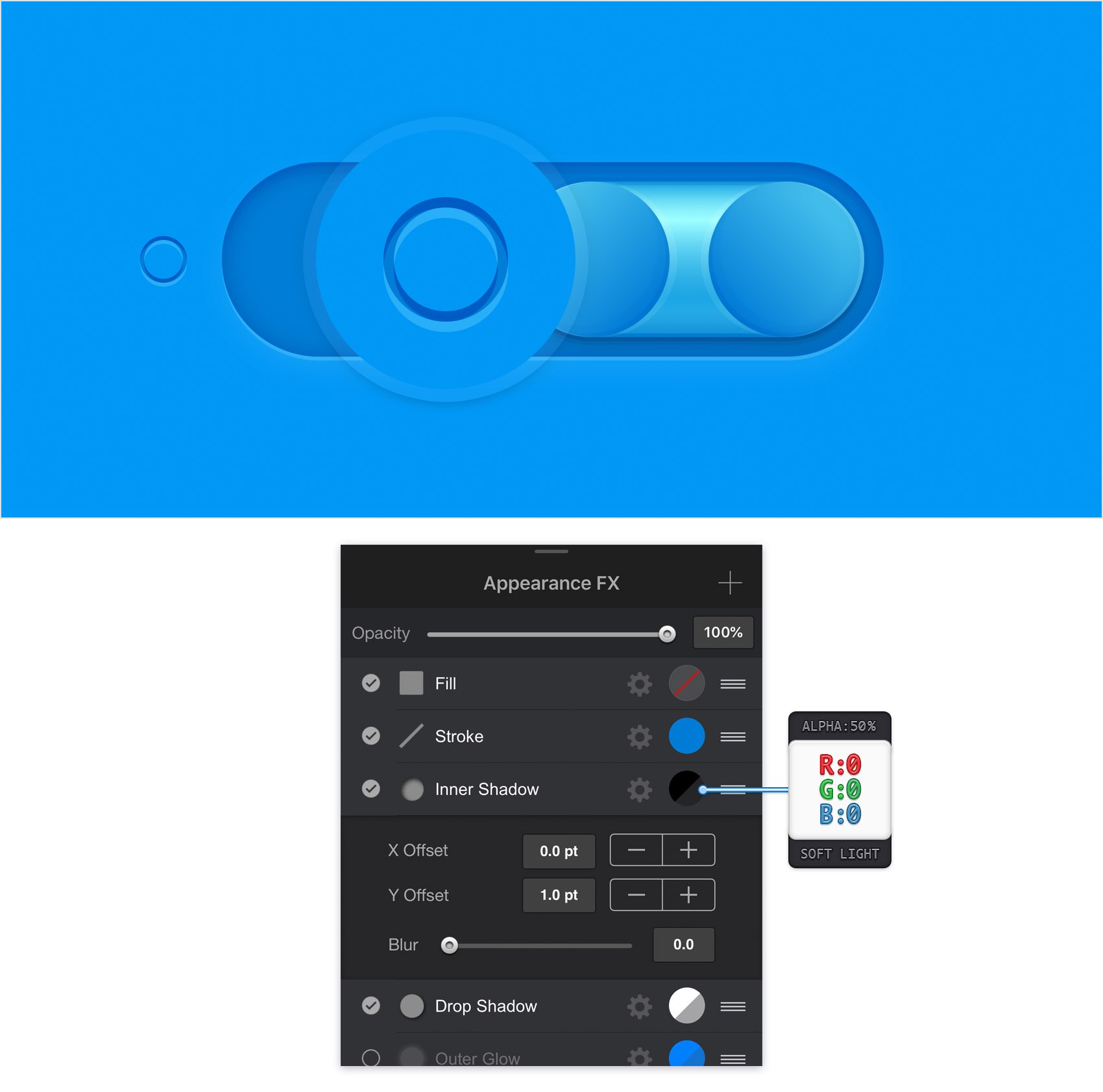
Step 32
Now, you will need a grid every 1 px. This means that you need to return to the Grid pane, open the Grid Settings pane and enter 1 px in both Spacing boxes.
Return to your Toolbar, make sure that the Line is invisible and then set the Fill color to white. Using the Ellipse Tool, create a 4 px circle and place it as shown in the following image. Make sure that this shape stays selected, focus on the Effects pane, select the existing Fill and enter the attributes shown in the following image.
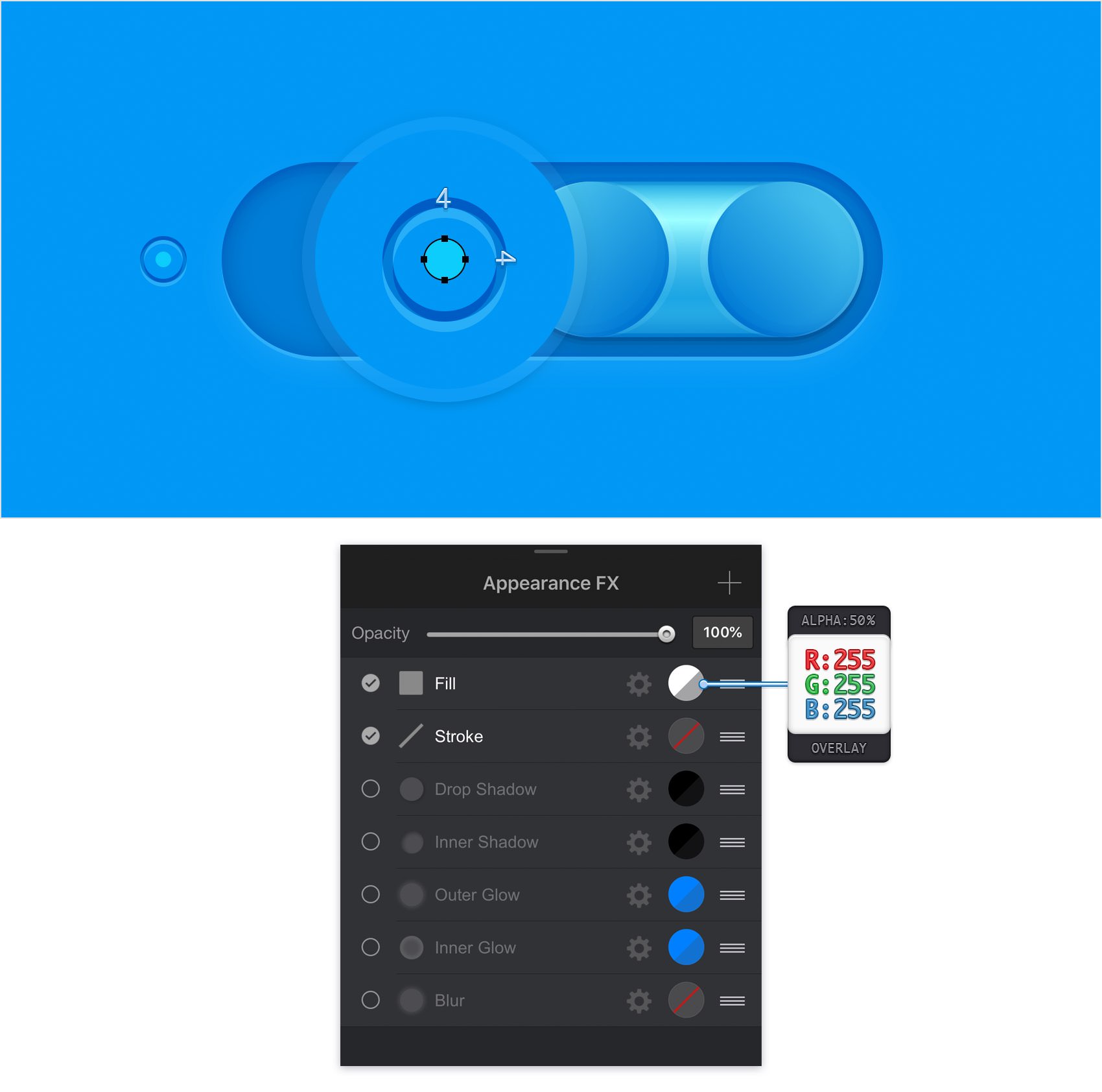
Step 33
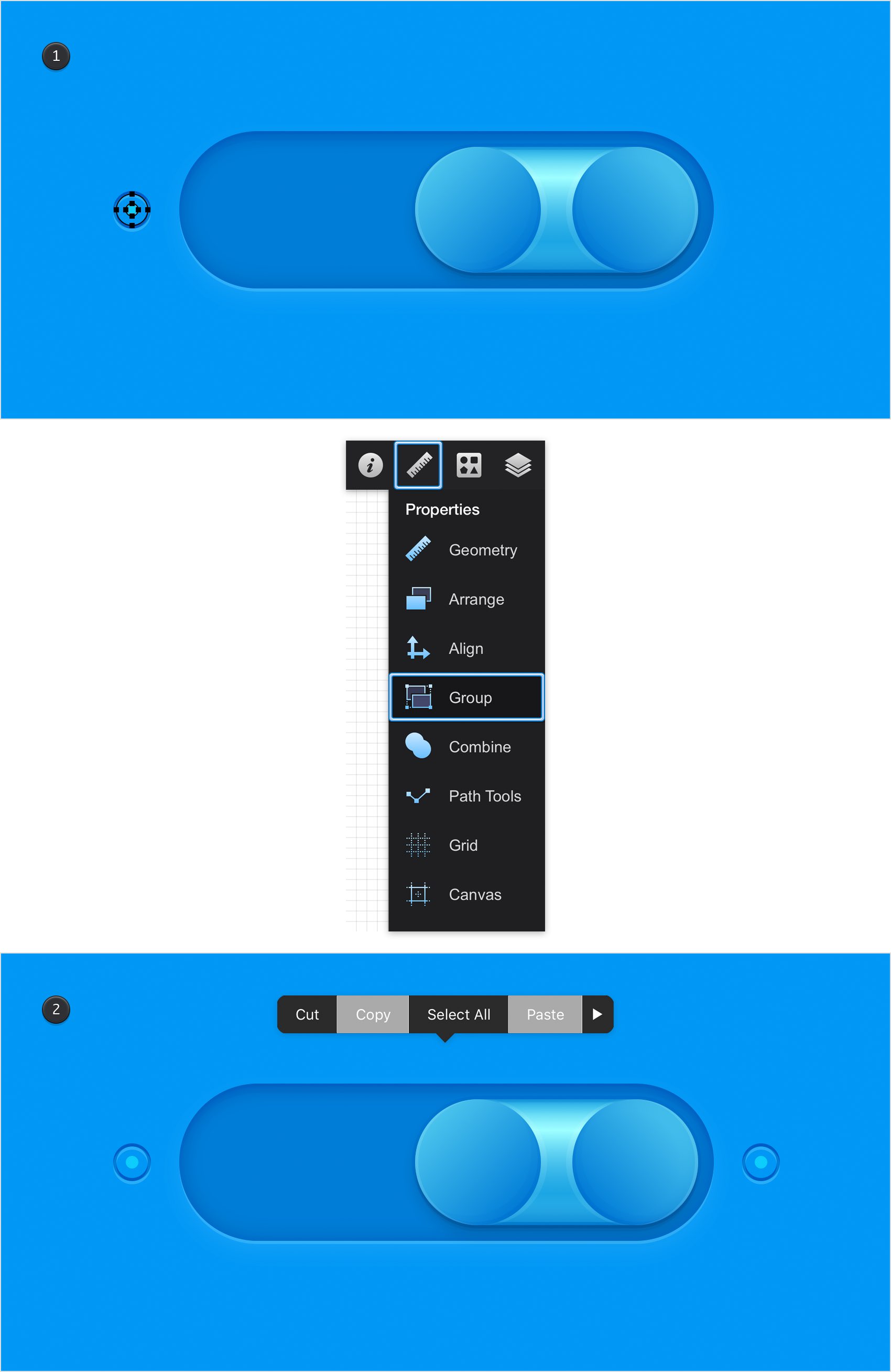
Pick the Path Selection Tool and activate the Add to Selection mode. Reselect your 10 px circle along with that 4 px circle, open the Properties panel and tap the Group command.
Make sure that your new group is selected, pick the Move Tool and then tap and hold to open that Edit menu. Use the Copy and Paste commands to make a copy of your selected group. Select this group copy, drag it to the right and place it as shown in the second image.
Finished Design
Congratulations, you've finished the tutorial!
Hope you've enjoyed learning some of the techniques and processes presented in these steps. As always, feel free to adjust the final design and make it your own.

Download Graphic File:
togglebuttons.idraw